Color is your loudest accessory, yet it should whisper where you walk. You’ll pair jewel-toned doors with light, matte walls to carve drama from a corridor, then anchor the pace with a bold runner or vibrant flooring that mirrors or counters wall hues. As you plan, consider lighting’s halo and finishes that withstand traffic, so your hallway feels intentional, not gimmicky. Curious which combination finally makes your space feel both expansive and intimate? Keep going.
Assess Your Space: How to Choose Bold Hallway Color for Small Areas
If your corridor feels tight, start by mapping what’s already there: the natural light, the ceiling height, and the width of the walls. You’ll then translate that data into bold decisions with intention. In small spaces, color psychology matters: choose hues that visually expand or energize without overwhelming. Consider a lighter base to amplify light, then introduce a bold accent in a key zone—near a mirror, haloed by a doorway, or along a single feature wall. When selecting paint, think about paint application techniques: crisp edge lines, subtle gradient gradual shifts, or a single, saturated sweep that feels deliberate rather than aggressive. Test swatches in multiple lighting moments, observe how accents shift with time, and pick a hue that sustains proportion, mood, and flow.
Pair Jewel-Toned Doors With Light Walls for Contrast
Pair jewel-toned doors pop against light walls, turning everyday corridors into statement spaces. You’ll notice how the door color anchors the view while the pale walls keep the lines airy and bright. This bold door-wall pairing creates sharp contrast that feels fresh, modern, and unmistakably intentional.
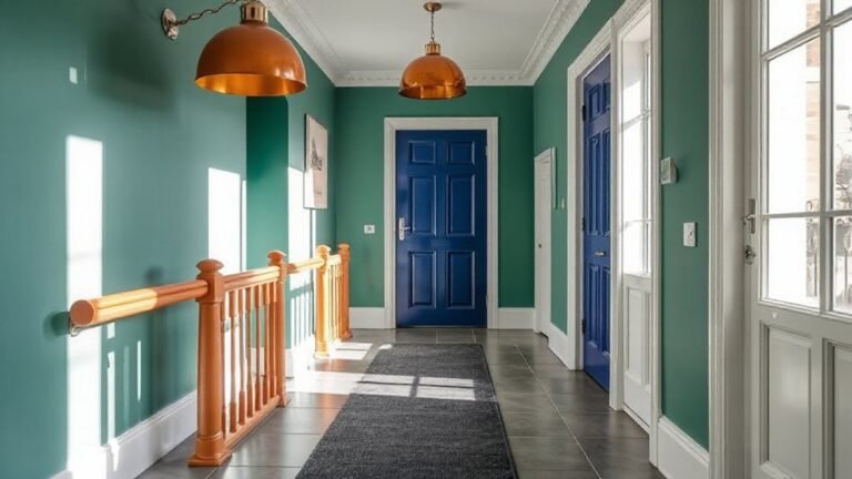
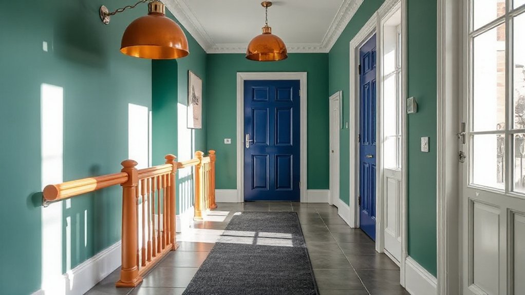
Jewel-Toned Doors Shine
Bright jewel-toned doors instantly elevate hallways, but the magic happens when you balance them with light walls that let the color pop instead of compete. You’ll pair jewel tones with crisp door accents to create a focused focal point without overwhelming the corridor’s momentum. Choose doors in saturated ruby, emerald, or sapphire, then keep surrounding surfaces airy—think matte whites, pale warm neutrals, or whisper-gray. This contrast sharpens perception of depth, making each step feel purposeful. Add subtle sheen to trim or a slim metallic strip for contemporary edge, avoiding busy patterns that clash with the hue. Your goal is controlled drama: let the door be the statement, while walls breathe and reflect natural light. The result is refined, bold, and undeniably modern.
Light Walls, Bold Contrast
When you flank jewel-toned doors with light walls, the color reads as a bold, refined accent rather than a loud statement. You create contrast that feels curated, not chaotic, embracing daylight to lift the hue’s saturation. Keep walls soft—almond, ivory, or pale gray—to let the doors glow and serve as focal points. Accent walls can reinforce this balance, using a muted tone that mirrors the door’s undertone for cohesion. Pairing with furniture accents—smoked brass, warm oak, or lucent glass—adds texture without overpowering the palette. Sustainable materials and matte finishes keep the look current, while crisp crown molding and clean lines preserve precision. The result is a hallway that reads sophisticated, modern, and welcoming, inviting curiosity without sacrificing calm.
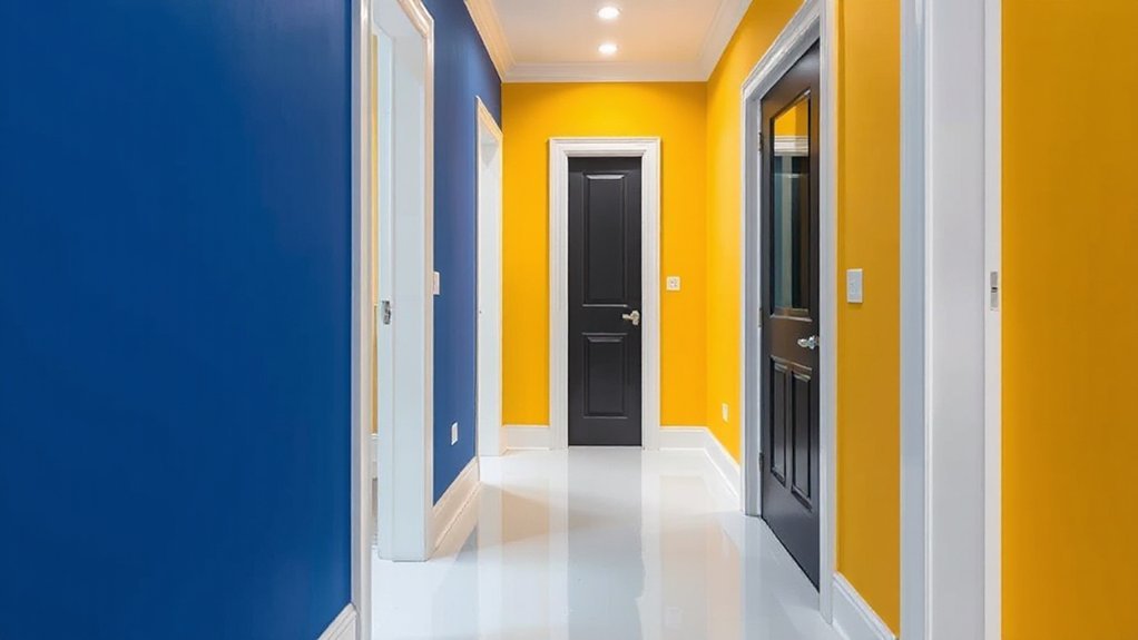
Door-Wall Color Pairing
Looking for the right balance? In door-wall color pairing, you’ll create momentum between jewel-toned doors and light walls that feels intentional, not accidental. You pair bold hues with airy backdrops to achieve door wall harmony, where the door becomes a focal point without overpowering the corridor. Use color contrast techniques to guide sightlines: a saturated door against a pale wall lengthens the passage, while a lighter door on a bright wall can soften the entry. Consider finishes and sheen—matte walls with gloss doors read modern and curated. Test scale first: a large door suits expansive hallways, while a small door benefits from a deeper hue. Keep hardware minimal, and let the color do the talking.
Color Pairing: How to Create Unexpected Wall Combos That Work
Color pairing can feel audacious, but the right combinations release hallway personality without shouting. You’ll surprise and satisfy with walls that feel intentional, not accidental. Begin by anchoring one hue you love to ground the space, then layer a contrasting yet cohesive partner for energy. Complementary color schemes work well for dynamic pop without chaos, especially when you balance saturation with white trim or pale ceilings to soften impact. Experiment with a bolder door or accent wall in that opposite hue, then keep surrounding walls calmer to let the moment land. Alternatively, explore monochromatic wall combinations for a calm, architectural effect; vary lightness and texture rather than color to add interest. Trust contrast, not clutter, to articulate your hallway’s mood.
Use Runners and Flooring as Color Anchors
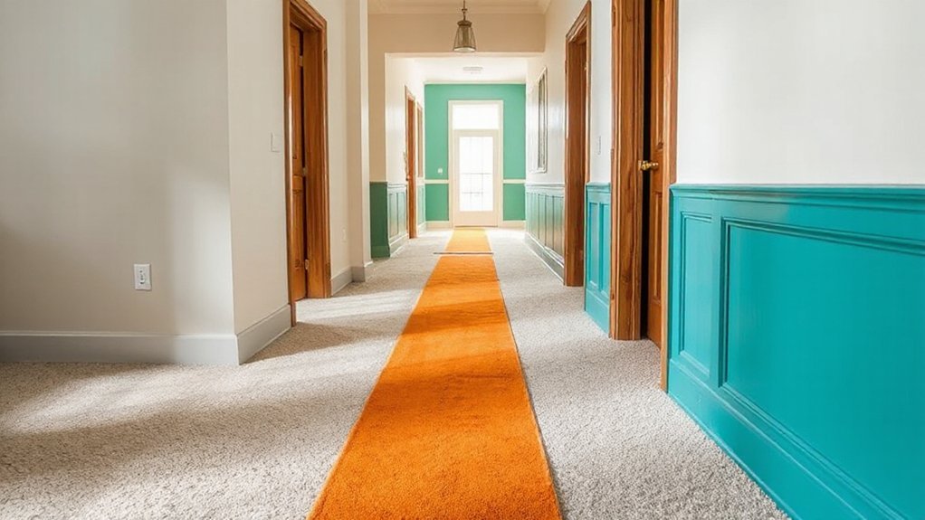
Runners and flooring aren’t just underfoot—they’re color anchors that pull the whole hallway together. You’ll use them to set a cohesive rhythm, guiding eye movement from entry to stairs without shouting. Select a runner that echoes or contrasts wall color to shape mood through color psychology, framing spaces with intentional momentum. In busy corridors, a bold but grounded floor offers calm, while a lighter path can expand narrow landings. Consider durable materials and precise paint application at junctions to keep edges crisp and purposeful. Pair the runner with a complementary floor tone that reveals texture and depth, then let your walls do the talking in quieter tones. Rely on careful sampling, balance, and intention to achieve a polished, modern cadence.
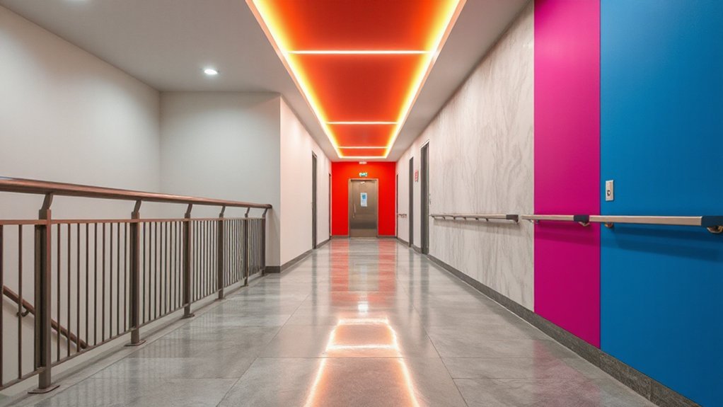
Lighting That Makes Bold Hues Pop
When you point lighting at bold hues, the walls stop competing and start speaking. You’ll shape mood and drama with precision, using light as a color amplifier rather than a mere fixture. Accent lighting becomes the hero, highlighting saturated tones without washing them out. Think cool vs. warm temperatures to cue color psychology, guiding how blue feels calm or red feels energetic. Dim to create intimacy, brighten to reveal texture, and balance across hallways to avoid glare. Subtle recessed spots or track lighting can glide along features, while statement pendants add runway impact. The goal is harmony: bold hues pop, not shout.
- Layered accents that target key walls
- Warm and cool balance to steer color perception
- Dimmable control for mood shifts
- Consistent glare-free illumination across spaces
Integrating Trim and Cabinetry Into a Cohesive Color Story
Bringing trim and cabinetry into a cohesive color story means treating them as core design elements, not afterthought details. You pair profiles with hues that reflect the hall’s lighting and architectural rhythm, ensuring every edge reads intentional. Start with a unifying palette: a restrained base and accent tones carried through doors, trim, and cabinetry panels. Color harmony emerges when you repeat undertones—cool greys with blue undertones or warm whites that pick up wood grains—across all surfaces. For contrast, use statement cabinetry in a color that echoes wall accents rather than competing with them, then ground with trim in a lighter shade to breathe space. Design cohesion hinges on consistent finish levels and precise cabinet hardware choices that reinforce the color story, not distract from it.
Durability and Finishes for High-Traffic Hallways
Durability and finishes for high-traffic hallways demand materials that tolerate daily wear without losing personality. You’ll prioritize coatings and textures that resist scuffs while keeping color intent true, so your bold entry stays bold over time. Think performance metrics, not just looks, and choose finishes that balance wipeable ease with tactile nuance. paint finish quality matters, and material durability underpins every eye-catching moment. You want progressions that feel premium yet practical, so invest in surfaces that clean up fast and age gracefully.
- Pick a low-sheen or satin paint finish for longer-lasting color without glare
- Pair durable sealants with color blocks to reduce abrasion risk
- Use resilient flooring options like modified vinyl or porcelain for high-traffic paths
- Apply protective edge treatments to maintain sharp color boundaries
Mood-Based Palette Ideas for Real-Life Hallways
Mood-Driven Color Schemes set the tone for real-life hallways, guiding how you feel as you move through the space. You’ll balance palette choices with the hallway’s light and traffic, creating an atmosphere that stays welcoming yet purposeful. Pairing hallway hues with mood-forward accents invites daily rhythm and keeps the journey visually cohesive.
Mood-Driven Color Schemes
If you want a hallway that guides mood as you move, start with a color scheme built around the vibe you want to feel hour after hour. Mood-driven palettes use color psychology to cue energy, calm, or focus, while nodding to Cultural influences that shape perception. Choose hues that shift subtly with lighting to maintain continuity, not clash.
1) Calming neutrals with soft accents for morning clarity
2) Warm terracotta and muted gold to energize evenings
3) Deep blue-gray with graphite touches for concentration
4) Sage green with ivory highlights to refresh and ground
Hallway Atmosphere Pairings
Pairing hallway atmospheres with the right mood-based palette is all about context—how light shifts, how people move through the space, and how color cues shape energy from step to step. You fuse mood with function by testing palettes under real lighting and traffic, then lean into decisive contrasts that guide flow. For bold, momentary drama, pair warm neutrals with deep accents and craft compartments of color via lighting cues, art, and textiles. Incorporate artistic wall murals where a focal wall absorbs reflection and texture, letting adjacent walls breathe. Use textured paint techniques on high-traffic surfaces to add tactility without glare, elevating proprioception and comfort. The result is a hallway that reads cohesive, dynamic, and effortless as you traverse it.
Balancing Natural Light With Bold Hallway Colors
Natural light can soften bold hallway colors, so choose hues that glow when sunbeams spill in and avoid shades that glare or wash out when the light shifts. You balance brightness with intent, letting natural light drive your color psychology, not overwhelm it. Pick colors that reflect or absorb light to shape mood and space perception.
- Test swatches at different daylight moments to confirm glow or glare.
- Pair saturated tones with lighter neutrals to maintain balance.
- Use matte or satin finishes to control bounce and depth.
- Introduce accent lighting that complements the daytime palette without competing.
Bold Colour Feature Ideas for Hallways and Landings
Bold colour features can turn hallways and landings from passageways into personality zones. You’ll transform narrow corridors with bold accents, creating focal moments that guide movement and mood. Consider a saturated wall panel paired with a matte ceiling to exaggerate scale, or a metallic trim that catches incoming light and slows the eye for dramatic pause. Color psychology informs you to align hues with function: calmer tones for changeover, energizing shades at entry points, and deeper tones to anchor long walls. Paint texture matters: a satin finish reads modern and flexible, while a subtle stucco or plaster effect adds depth and tactility. Balance contrast with cohesive undertones to maintain flow, ensuring bold ideas stay intentional, not chaotic.
Frequently Asked Questions
Which Bold Colors Hide Scuffs in High-Traffic Hallways?
Yes—go with bold, forgiving hues like deep charcoal or navy, paired with lighter neutrals. Use textured paint techniques and bold color pairing to hide scuffs, and you’ll keep hallways looking sharp even in high traffic.
How to Prevent Glare With Bold Hallway Wall Colors?
“Think of glare as a bad photograph.” You prevent glare by thoughtful lighting placement and color contrast; choose wall colors with matte or low-sheen finishes, place hideaways so reflections avoid eye level, and blend lighting angles to soften brightness.
Can Bold Hues Affect Room Perceived Size From the Doorway?
Yes, bold hues can alter perceived size from the doorway. doorway illusion emerges when color psychology nudges walls and ceilings, making spaces feel taller or cozier depending on saturation and contrast. You’ll notice mood shifts and spatial cues fast.
Which Finishes Suit Bold Hallways With Kids or Pets?
Durability matters, so choose wall paint finishes that hide fingerprints and scuffs, like satin or matte enamel. You’ll love kid-friendly color schemes that stay vibrant, while pet-friendly options resist wear and wipe clean with ease.
How to Repaint Without Color-Matching Issues With Existing Trim?
To repaint without color-matching issues, you’ll nail color palette coordination and avoid mismatches by sampling in daylight, testing swatches next to trim, and using consistent undertones; then apply precise trim painting techniques with painter’s tape and seals.
Conclusion
Bold hues in hallways aren’t about shouting, they’re about guiding the eye. When you pair jewel-toned doors with light walls and layer in metallic trims or textured finishes, you’ll see space feel more dynamic and inviting. Use bold flooring or runners as anchors, balance with smart lighting, and pick durable finishes for high-traffic zones. Think mood-first palettes, natural light, and confident contrasts. Your hallway will become a stylish, cohesive passageway that breathes personality into every step. Like a compass, color points the way.