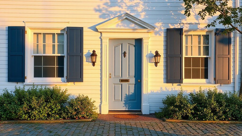
Blue and white will feel like a calm compass guiding your period home through time. You’ll find that white walls showcase moldings and fixtures, while blue accents add depth without dominating the room. The right tones balance heritage with subtle modernity, creating understated elegance you can refine over years. But the question remains: which shades and finishes best honor your home’s era while staying quietly current? Keep exploring to uncover how to achieve that timeless harmony.
Why Blue and White Elevate Period Homes
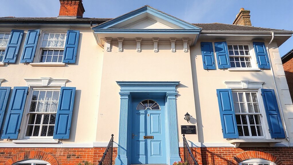
Blue and white palettes breathe timeless clarity into period homes. You experience how this pairing creates a calm, airy atmosphere that resists fad trends and supports architectural details. The contrast emphasizes lines, moldings, and fixtures, letting historical features breathe without overwhelming them. Color psychology informs your choice: blue evokes serenity and order, while white reflects light to enhance perceived room height, depth, and usability. This combination also aids historic storytelling, aligning modern living with a sense of place. You prioritize historical accuracy by selecting shades rooted in era-appropriate palettes, avoiding jarring contemporary hues. The harmony balances authenticity with function, enabling you to update interiors without discarding heritage. Essentially, blue and white elevate period homes by clarifying space, reinforcing character, and respecting provenance.
How to Choose Authentic Blue Tones for Historic Interiors
To choose authentic blue tones for historic interiors, start by researching era-appropriate palettes and sourcing pigments that mirror period newspapers, paint catalogs, or architectural guides. You’ll assess undertones, from muted slate to bright cobalt, ensuring hues align with architectural details and light conditions. Prioritize Historical color accuracy by comparing several reference sources, noting how pigments age, fade, or change with varnishes and climate. Consider historical techniques, such as liming, glazing, or distemper, to reproduce finishes authentically rather than modern equivalents. Document your selections with color chips, supplier provenance, and era citations, then test samples in situ before committing. Acknowledge Cultural significance by recognizing regional preferences and symbolic meanings tied to blues in civic buildings, churches, and homes. This disciplined approach yields credible, period-true color outcomes.
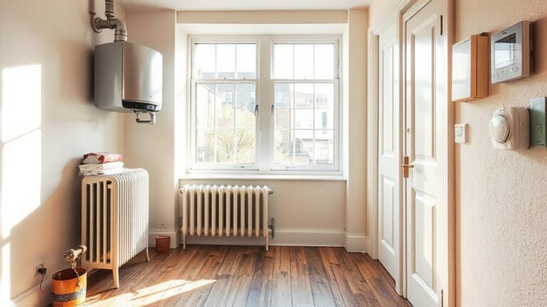
White Walls and Architectural Features That Enhance Period Detail
White walls, when paired with carefully chosen architectural features, illuminate period details rather than obscure them. You’ll notice how subtle molding, cornices, and door casings reclaim historic character without sacrificing modern clarity. This approach emphasizes texture, light, and proportion, so each element reads as intentional part of the whole. You’ll benefit from restrained finishes that keep the focus on form and craftsmanship, rather than saturation. Vintage accents and textured finishes enrich the narrative, adding warmth and tactility without overpowering the space. The result is a coherent, refined backdrop that enhances blue-and-white schemes and guards authenticity.
- Thoughtful molding echoes era lines while remaining legible in contemporary rooms.
- Painted ceilings or plaster details create vertical drama without crowding walls.
- Subtle hardware and trim highlight architecture with quiet confidence.
- Textured wall surfaces add depth, revealing handcrafted heritage.
Room-by-Room Blue-and-White Palettes and Practical Pairings
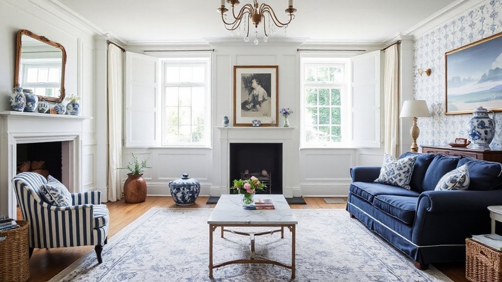
A room-by-room approach helps you harness blue-and-white palettes with practical pairings that feel intentional and fresh. In living areas, balance navy accents with crisp whites, and elevate ceilings with a coordinated rug and porcelain lamps that echo Vintage textiles. In kitchens, choose ceramic-painted cabinets or tile backsplashes that contrast softly with light stone countertops, so Antique ceramics become focal points without shouting. In dining rooms, select a restrained tableware set in mid-blue tones and balance with white linen and a wooden surround to keep the space grounded. For bedrooms, layer shallow-blue textiles against bright walls, using unpatterned textiles to anchor patterns elsewhere. This method preserves clarity, avoids clutter, and respects period details while remaining quietly modern.
Maintenance, Layering, and Timeless Finishes
Maintenance challenges in blue-and-white schemes demand a practical approach: choose durable finishes, plan routine care, and layer textures that conceal wear. You’ll prioritize interior durability by selecting washable paints, resilient fabrics, and low-maintenance surfaces, while still preserving timeless charm. Color psychology informs your palette decisions, balancing calm blues with crisp whites to reduce perceived wear and enhance daylight. You’ll layer materials—rough textures against smooth enamel—to hide small scuffs and patina, keeping rooms cohesive over decades.
- Choose resilient textiles and finishes that age gracefully
- Schedule regular cleaning and inspection to prevent deterioration
- Layer patterns and textures to mask wear without sacrificing harmony
- Reassess lighting and color balance to sustain durable, tranquil atmospheres
Frequently Asked Questions
How Do Blue and White Affect Natural Light in Period Rooms?
Blue and white brighten rooms with natural light, reflecting and widening spaces. You’ll feel airier and calmer, yet maintain color psychology balance. This preserves Historical accuracy while subtly moderating glare in period interiors.
Which Blue Finishes Are Most Suitable for Plaster Ceilings?
Blue glaze finishes suit plaster ceilings best when you choose matte versus gloss blue for subtle depth; matte hides flaws, while gloss brightens. You’ll appreciate the sheen contrast, and consider durable, breathable paints for long-lasting finish.
Are There Regional Historic Constraints on Blue-And-White Schemes?
Yes, there are regional color regulations and historic preservation guidelines you’ll need to take into account, though they seldom prohibit blue-and-white schemes outright; you can argue taste, but you’ll still align with local standards and approvals.
How Can You Layer Textures Without Overpowering Architectural Details?
To layer textures without overpowering details, you maintain textural contrast while keeping architectural lines clear, using subtle decorative accents that echo the room’s rhythm. Balance materials, scale, and finishes, ensuring each element complements rather than competes.
What Are Budget-Friendly Authentic-Blue Alternatives for Relic Spaces?
Color matching guides your choice of budget-friendly authentic-blue options, blending with antique accents to evoke relic spaces. You’ll notice depth through careful layering, and you’ll appreciate how each shade pairs with worn textures, preserving patina while staying affordable.
Conclusion
You’ll find that blue and white gracefully soften the past, never overshadowing the story it tells. With careful, considerate choices, you avoid gimmickry and keep authenticity intact. It’s a gentle push toward cohesion, a quiet nod to history that invites calm without apology. Embrace subtle contrast, refined textures, and proper patinas, and your period home will exhale timeless charm. In this balance, blue and white become a refined refrain—pleasant, respectful, enduring.