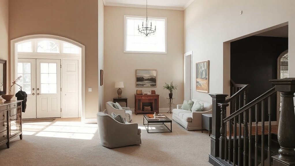
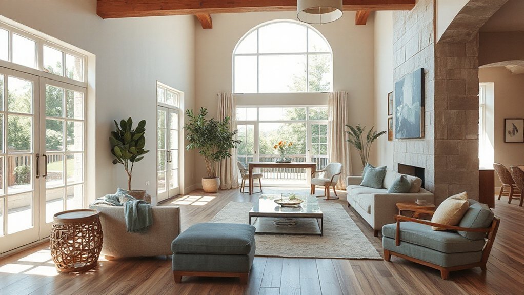
Take, for example, you want a calm living area that still feels fresh as you move from room to room. You’ll start by naming a core color story and choosing a main color with supporting undertones, then consider how light and space shift those tones. From there, you’ll create room-to-room flow and anchor the palette with furniture and textiles. Keep a practical test plan and be ready to evolve—your home should feel cohesive, not fixed, and the next step awaits.
Define Your Core Color Story
Your core color story is the backbone of your palette. You’ll map how your spaces feel and function, not just how they look. Define a narrative you’ll live with daily: a mood, a memory, a place you love. Consider color psychology—how hues affect energy, calm, focus, and interaction—with practical checks like lighting, room purpose, and traffic patterns. Weigh historical influences that shape taste: eras, crafts, and culture that resonate with you without dictating every choice. Capture your story in a short statement you can reference when selecting swatches. Use it to filter options during discovery, narrowing options to a cohesive thread. The result: a unified scheme that respects both emotion and context, guiding consistent, intentional decisions across your whole home.
Choose a Main Color With Supporting Undertones
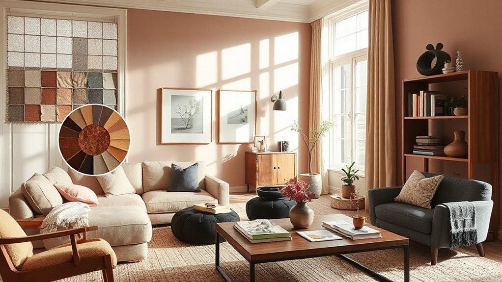
Choosing a main color sets the tone for your whole home, so pick one that feels right on first glance and supports the story you’ve defined. Start with a dominant hue, then layer undertones that reinforce depth without clashing. Undertones matter because they subtly shift perception under different lighting and furnishings. Consider cool undertones (blue, green) to calm spaces, or warm undertones (red, yellow) to invite energy. Use color psychology to map intention: a blue-gray can feel serene in living areas, while a charcoal undertone on walls adds sophistication in hallways. Balance emotional impact with practicality—test swatches in situ, observe over a week, and note reactions. The goal is cohesion, not matchy-matchy. Choose undertones that harmonize with furniture and fabrics, ensuring a unified, purposeful mood throughout your home.
How Light and Space Affect Color Perception
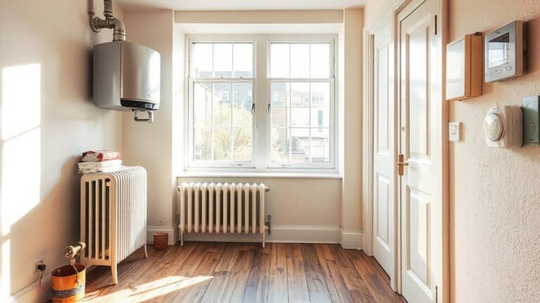
Light and space don’t just host color—they shape how it reads. You’ll notice that brightness shifts mood, and room size alters intensity. Larger, well-lit spaces can carry cooler tones more cleanly, while small or dim areas make colors feel warmer or muddier. Consider how light changes throughout the day: morning sun can brighten yellows and creams, evening light deepens blues and greens. Your choices should account for this by testing swatches at different times and in multiple rooms. Lighting effects, whether from windows or fixtures, can transform perceived saturation and contrast, so plan color with these dynamics in mind. When evaluating natural versus artificial light, recognize that artificial LEDs or warm incandescent tones will skew undertones differently—adjust your palette accordingly.
Create Room-to-Room Color Flow
You’ll carry a consistent hue progression from room to room, so your spaces feel connected rather than separate. Use neutrals as bridges to join bold accents, keeping the shifts smooth without visual jolts. Let that accent color bridge recur in small doses to reinforce continuity while letting each room serve its own purpose.
Consistent Hue Progression
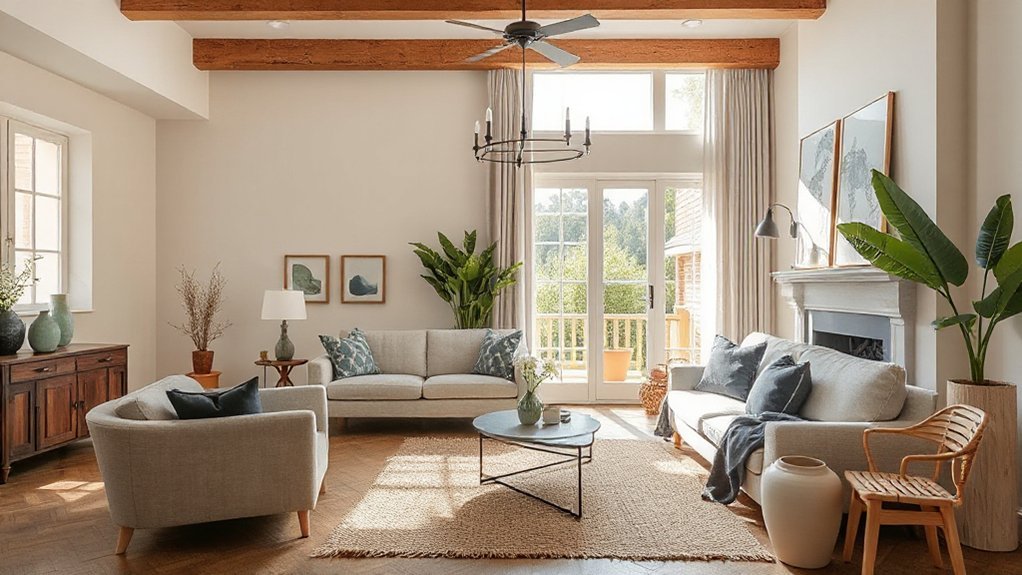
Consistency in hue progression keeps rooms read as a single story. You’ll guide the eye from space to space by repeating core hues at varying saturations and intensities, avoiding abrupt shifts. Start with a dominant color for walls or major surfaces, then echo it in textiles, artwork, and furnishings to create continuity. Use subtle shifts in temperature or value to distinguish rooms while preserving cohesion. Consider color psychology when choosing a base and its accents, ensuring feelings align with each area’s function. Reference historical palettes for depth—lean on muted classics or period-inspired combos to add character without breaking flow. Test swatches in natural light across times of day, calibrate your balance, and adjust until progression feels deliberate, not accidental.
Connect Through Neutrals
Neutrals are the quiet glue that ties rooms together, allowing you to move from one space to the next without jarring shifts. You’ll create room-to-room cohesion by repeating undertones—warmth, coolness, or depth—across finishes, fabrics, and furnishings. Start with Neutral layering: vary texture and shade within the same family, so each room reads as related but not identical. Use matte paints, woven textiles, and natural materials to reinforce continuity without monotony. Introduce Subtle contrast through light-to-dark gradations and controlled pops—think a charcoal rug against a lighter sofa, or a wood tone that shifts slightly from room to room. Keep edges soft and gradations thoughtful, so when you step from, say, living to dining, the look remains harmonious, not disjointed.
Accent Color Bridges
Ever notice how a single accent color can travel through a home and feel intentional rather than jarring? You can design room-to-room color flow by defining a few consistent accent hues that surface in textiles, art, and accessories across spaces. Prioritize color contrast between surfaces and accents; a brighter throw against a muted wall creates focal points without shouting. Use repeats of the same accent in varied scales—pillow, vase, rug edge—to unify rooms while preserving individuality. Think about mood enhancement: cooler accents tend toward calm, warmer ones energize, so align choices with each room’s function. Keep the palette tight—two to three accent colors max—then let neutrals ground progressions. With deliberate placement, your home feels cohesive, purposeful, and visually connected.
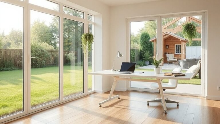
Anchor Your Palette With Furniture and Textiles
Begin by grounding your palette in the furniture and textiles you love most. When you choose anchors, you set a reliable reference point for every room. Start with your seating and major pieces, then bring in textiles that echo their tones and undertones. Use a dominant hue from a favorite sofa or chair as the backbone, and layer with lighter or darker variations to create depth. Consider how furniture arrangement guides flow and rhythm, letting larger pieces anchor sightlines while smaller textiles bridge gaps. Textiles patterns offer texture without overwhelming color; mix solids with subtle prints to avoid clashes. Confirm each room’s textiles reinforce the same mood, so the whole home reads as a single, cohesive story.
Test Colors in Real Spaces (Practical Steps and Tools)
To guarantee your chosen colors truly work, test them in real spaces before committing. Start with sample pots on small wall patches in each room, applying the same paint finish options you plan to use—matte, eggshell, satin, or semi-gloss—to see texture and sheen in different lighting. Observe color under morning, midday, and sunset light, noting how it shifts with adjacent neutrals and wood tones. Use large swatches or temporary boards to compare against furniture and flooring; avoid relying on tiny chips alone. Consider color psychology—how hues affect mood and perceived room size. Track impressions in a simple notebook or digital note, then finalize with a targeted color family. This practical approach prevents costly missteps and aligns mood with function.
Apply the Palette to Walls, Surfaces, and Materials
Now that you’ve tested color in real spaces, it’s time to apply your palette across walls, surfaces, and materials in a coherent way. Begin with wall colors that reinforce the room’s function: soft neutrals for living areas, calm tones for bedrooms, and accent walls only where you want focal impact. Choose paint finishes deliberately—matte for walls to hide flaws, satin for trim and doors, and muted gloss for surfaces that need light reflection without glare. Apply color psychology by pairing cooler hues with bedrooms for restfulness and warmer hues in social zones to invite conversation. Extend the palette to floors, cabinetry, fabrics, and hardware in restrained dosages, maintaining tonal harmony. Revisit contrast, ensuring accessibility and effortless flow from room to room.
Adapt Your Color Story Over Time
As your space evolves, let your palette evolve too—keep a core, timeless base and introduce progression accents to reflect changes in lighting, furniture, or mood. Plan how you’ll shift tones slowly, so the story remains cohesive while feeling fresh over time. Start with small swaps—swap a throw, add a new art piece, or adjust an accent color—so your color narrative stays practical and perceptive.
Evolve Your Palette
If your color story feels stuck, you can evolve your palette by embracing small, purposeful shifts over time. You’ll start by mapping which rooms feel intentional and which feel dated, then pick one area to adjust seasonally or annually. Focus on color psychology: brighter accents can energize a space, softer tones invite calm, and deeper hues ground busy rooms. Use this insight to guide subtle changes rather than full redecorations. When selecting paint finish options, choose durable matte for living areas and a wash of satin in kitchens or baths for easy maintenance; in a single room, combine finishes to add texture without disrupting cohesion. Document a simple sequence—test, observe, refine—so the evolution remains deliberate and cohesive, not chaotic.
Timeless Yet Transitional
A timeless yet shifting color story blends enduring neutrals with gentle shifts that keep a space feeling fresh without demanding a full redecorating effort. You’ll adapt your color arc over time, testing small accents before committing to big changes. Begin with versatile foundations—warm whites, greiges, and taupes—that read as timeless backdrops. Introduce vintage charm through curated textures, subtle patterns, and occasional warm wood for character, then layer in accent hues that nod to modern minimalism: restrained blues, muted greens, or charcoal as an anchor. When you’re ready, swap in a few accessories, textiles, or wall art to refresh the mood without overhauling the palette. This approach protects investment, respects architecture, and supports a cohesive whole-home flow that evolves gracefully.
Frequently Asked Questions
How Do I Avoid Color Clashes Between Vintage and Modern Styles?
You avoid clashes by embracing vintage harmony with restrained palettes and leveraging clean lines for modern contrast. You pair soft, warm tones with bold accents, balancing textures, and keep metallics minimal to let both styles breathe and coexist gracefully.
Can Color Choices Affect Room Acoustics or Mood?
Sure, color choices affect mood and even acoustic effects. Color psychology guides you to calmer vibes; acoustic effects arise from materials and layout. You’ll notice you feel calmer in cool tones, louder echoes with hard surfaces—practical, perceptive, ironic.
What Are Common Lighting Mistakes That Distort Color Perception?
Yes—common lighting mistakes distort color perception. You’ll notice it with mismatched lighting fixtures and improper color temperature, which wash or skew tones. Use balanced temperature, layered fixtures, and test samples to preserve true colors throughout your space.
How Many Neutrals Are Too Many in a Single Home?
You should limit neutrals to three zones max; more than that can feel disjoint. Use a neutral palette as anchors and save color coordination for accents. Keep contrast subtle, cohesive, and balanced across rooms for harmonious flow.
Should I Test Color in Small or Large Wall Areas First?
Yes—start with small areas to test, then scale up. Use paint swatch testing on a wall you’ll see daily, and do a sample room preview to confirm lighting and mood before committing. Adjust as needed.
Conclusion
You’ve mapped a core color story, picked a main hue with subtle undertones, and lined up furniture as anchors. Now, as you walk from room to room, watch for those quiet moments of contrast and harmony—your palette whispering, never shouting. Test, adjust, and let light reveal its truth. The finish isn’t finished; it evolves with daily life. Stay observant, stay practical, and let every space silently confirm: your home, united yet alive, is ready to welcome you in.