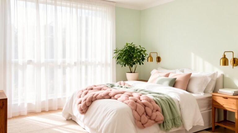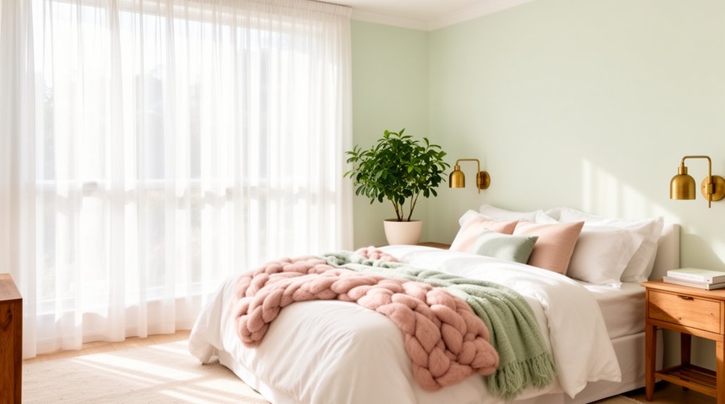
Bright, airy bedrooms start with light walls that reflect natural daylight and make the space feel bigger. Choose cool neutrals like soft whites or pale blues, or warm off-whites to avoid dullness, with matte or eggshell finishes to cut glare. Layer lighting—overhead, task, and accent—and pick soft white bulbs to keep colors pure. Try calm palettes like mist and moss or sage with sunlit wood. Ready-made schemes and subtle seasonal tweaks keep it cohesive as you go deeper.
Why Light Walls Make Bright, Airy Bedrooms Feel Bigger
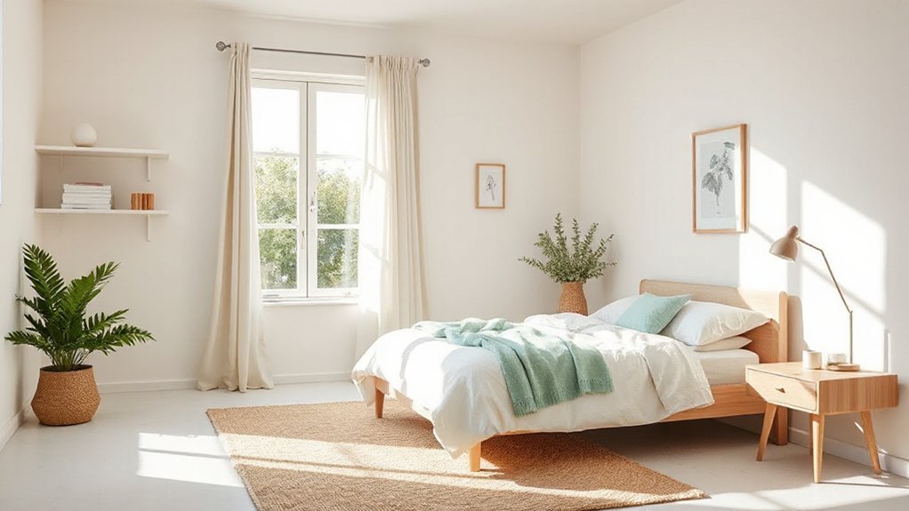
Light walls reflect more natural light, so your room feels brighter and more spacious. When you choose light wall finishing, you maximize daylight, making even small bedrooms read larger.
Color psychology matters here: cool neutrals like soft whites and pale blues can enhance perceived airiness, while warm off-whites avoid dullness without shrinking the space.
Keep the finish matte or eggshell to reduce glare and keep reflections intentional, not overpowering.
You’ll gain depth by pairing light walls with slightly darker trim or architectural features, which adds definition without crowding the room.
Practical tip: test paint samples on large patches to observe how natural light shifts colors throughout the day.
With thoughtful wall finishing, brightness stays consistent, and the space feels more open.
Soft Accents That Keep a Room Calm: Five Proven Palettes
Soft accents keep a room calm by pairing muted tones with simple contrasts that don’t shout. You’ll find five proven palettes that feel airy yet grounded, each guided by color psychology and Feng shui principles to support flow and balance.
- Mist and moss: soft greens with warm whites create a fresh, restful backbone.
- Sand and slate: beige, taupe, and cool gray offer understated contrast for a serene backdrop.
- Blush and ash: pale pinks anchored by charcoal provide gentle warmth without overpowering light.
- Sage and sunlit wood: muted greens with warm wood tones invite calm and subtle energy.
- Powder blue and ivory: cool airiness paired with clean, luminous neutrals for clarity.
Choose one as your base, add small accents, and preserve open sightlines.
Texture and Material Pairings for a Breathable, Natural Look
You’ll start by pairing natural wood textures with airy fabrics to build a breathable base. Layer linen and cotton for softness and keep woven surface finishes visible to add tactile interest.
This combination creates a light, natural look that stays warm and inviting.
Natural Wood Textures
- rustic accents through exposed timber beams or a reclaimed headboard
- wooden furniture with soft, matte finishes for harmony and depth
- mixed grain combinations that contrast lighter walls with richer floors
This approach stays practical: choose quality, maintainable pieces, and balance shine with matte, so the room breathes.
Linen and Cotton Layers
Opt for a crisp, undyed linen sheet set and a soft cotton duvet cover in a pale, airy shade to keep the room feeling open. Choose a natural weave for added texture without heaviness, and let the fibers breathe by avoiding heavy synthetics.
Mix small-scale patterns sparingly to maintain calm, then introduce accent pillows in subtle contrast to emphasize quiet, organic warmth. This approach supports brightness while preserving tactile depth, ensuring a practical, polished look that ages gracefully.
Woven Surface Finishes
- Linen-blend textiles on cushions and drapes for a crisp, breathable surface texture.
- Jute or rattan accents to introduce natural warmth and subtle grain.
- Lightly woven wall coverings or banners to add interest without bulk.
These textures balance airiness with tactility, supporting a bright, calm retreat.
Lighting Your Space to Boost Color and Mood
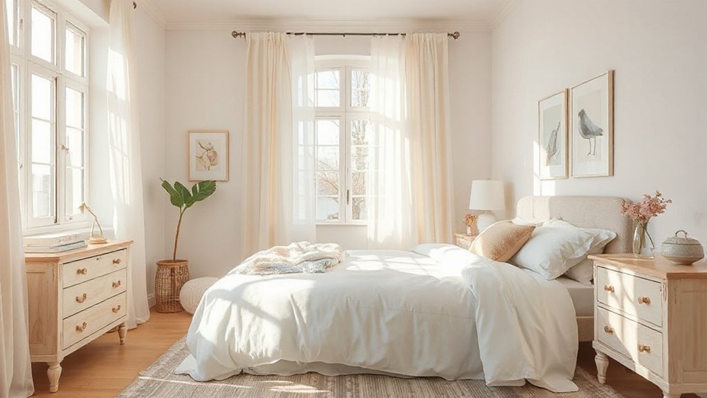
Good lighting does more than illuminate a room—it shapes how colors read and mood feels. You’ll boost color and mood by layering light sources: overhead, task, and accent lighting, so no corner feels dim or flat.
Use soft, white or warm-white bulbs to preserve color integrity while keeping spaces inviting. For color psychology, choose lighting temperatures that support the vibe you want—cooler tones for calm focus, warmer tones for coziness.
Dimmer switches let you adjust intensity as daylight shifts, preserving the room’s brightness without glare.
Highlight architectural features or favorite fabrics with directed LEDs, but avoid overdoing it; even, balanced illumination helps colors appear true.
Choose fixtures with clean lines to maintain the airy feel and prevent visual clutter.
Ready-Made Palettes for Small and Large Bedrooms
Ready-made palettes offer a quick path to cohesive color schemes for both small and large bedrooms. With ready-made options, you get tested combinations that balance mood and practicality, saving time without sacrificing style.
You’ll see how color psychology informs pairings—calming neutrals for restful spaces, or brighter accents to energize a room—while keeping furniture coordination front and center.
Choose palettes that align with your furniture layout, so textures and tones don’t clash or feel disjointed.
- Soft neutrals with contrast trims to keep a small room feeling airy yet defined
- Mid-tone greens or blues paired with wood finishes for natural harmony
- Warm accents against cool bases to create visual depth and cohesion
Seasonal Palette Swaps That Stay Subtle and Cohesive
Seasonal palette swaps can refresh a bright, airy bedroom without losing cohesion. You’ll keep your base neutrals and introduce calm, purposeful accents that map to the season.
Think seasonal color shifts that flip a single, soft hue rather than overhaul the scheme. Swap pillow covers, throws, or a duvet edge in a complementary tone, preserving lightness and balance. Choose subtle hue variations within the same family to avoid jarring contrasts, ensuring fabrics and furnishings read as one continuous tapestry.
Limit new additions to three pieces to prevent clutter. Maintain tonal grounding with natural textures—linen, cotton, or wool—so tweaks feel tactile, not trendy.
Document the swap as a small, intentional update you can repeat quarterly.
Frequently Asked Questions
How Do Colour Schemes Affect Sleep Quality in Bright Bedrooms?
Color psychology shows that your sleep environment matters: bright rooms can disrupt melatonin, so you should soften with muted accents and dim lighting. You’ll sleep better when you control color temperature and create calm, cohesive color rhythms.
Which Hues Promote Focus Without Feeling Clinical in Airy Spaces?
You wonder which hues sharpen focus without feeling clinical. Try muted blues and warm greens—they support mood enhancement, relying on color psychology to calm and energize. You’ll stay practical, focused, and polished in airy spaces.
Can Bold Accent Colours Work With Soft Neutrals Simultaneously?
Yes, bold accents can pair with soft neutrals—neutral harmonies keep calm, while bold accents add energy. You’ll create contrast without clashing, maintaining balance and focus in a bright, airy space.
How Often Should You Refresh Textiles to Maintain a Fresh Look?
You should refresh textiles every 6–12 months; satirically, you’d swear they age faster than your coffee. Textile longevity varies by use, but plan seasonal updates to keep fabrics looking fresh and coordinated across rooms.
What Are Budget-Friendly Ways to Test New Palettes Before Painting?
You can try DIY testing with sample swatches, fabric, and mockups on walls, then refine before committing, using budget palettes. This practical approach keeps costs down while you verify lighting and mood, ensuring confident color decisions.
Conclusion
Open the door to a room that feels sunlit, even on a cloudy day. Picture soft walls brightened by airy accents, like a breath of linen and a whisper of natural textures. You’ll move through a space that’s calm yet vibrant, where lighting plays with color the way morning light does with a pale, fresh canvas. Keep palettes simple, swap seasons subtly, and you’ll savor a breathable, welcoming retreat that grows with you.
About the Author