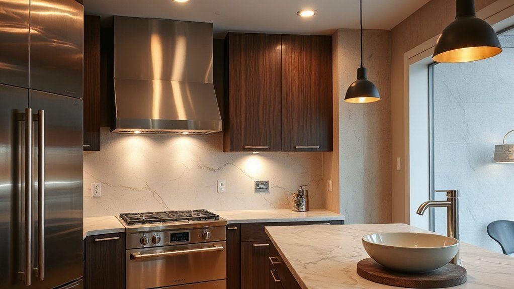
Mixing metals in kitchens and baths works when you anchor the space with a dominant finish and support it with complementary accents. Choose one metal as the backbone—like brushed nickel or polished chrome—and plan where others will appear, from hardware to fixtures and lighting. Consider lighting, durability, and maintenance so finishes age well. Get the balance right, test contrasts under different conditions, and you’ll see how a cohesive scheme emerges—with choices ahead that keep the room from feeling cluttered.
Why Mixing Metals Works in Kitchens and Bathrooms
Mixing metals in kitchens and bathrooms works because different metal finishes reflect light differently and create visual contrast without clashing. You’ll benefit from intentional contrasts that highlight architectural details and fixtures while keeping surfaces practical. This approach relies on consistent color coordination across metals to maintain harmony, not uniform sameness. You’ll plan metallic pairs by tone—from cool to warm—so reflections don’t fight for attention. Think about metal maintenance: choosing resistant finishes or easy-clean surfaces reduces upkeep and preserves brightness. Consider fixture heights, hardware styles, and sink or faucet finishes as a cohesive set rather than isolated accents. Practical execution uses a dominant metal as a neutral anchor, with secondary metals providing deliberate highlights. When color coordination fits the space, you’ll enjoy balanced, legible design that enhances usability and perception of space.
Set a Unifying Undertone for Cohesion
To achieve cohesion, set a unifying undertone that threads all metal finishes through a single, underlying characteristic—such as temperature (cool or warm) or material family (stainless steel, brass, or bronze). You should identify a common thread and apply it consistently across fixtures, hardware, and surfaces. This approach reduces visual noise while preserving variety. In practice, select items that share a defining attribute—cool metals for a crisp, modern feel or warm metals for comfort and tactility—and carry that choice through lighting, cabinetry accents, and sink hardware. Consider color psychology when pairing finishes to evoke intended moods, and evaluate material durability for each piece within the same family. This disciplined method sustains coherence without sacrificing contrast or function.
Classic Metal Pairings: Brass, Nickel, Chrome, and Black
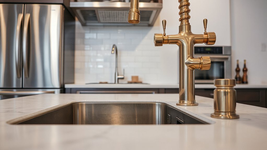
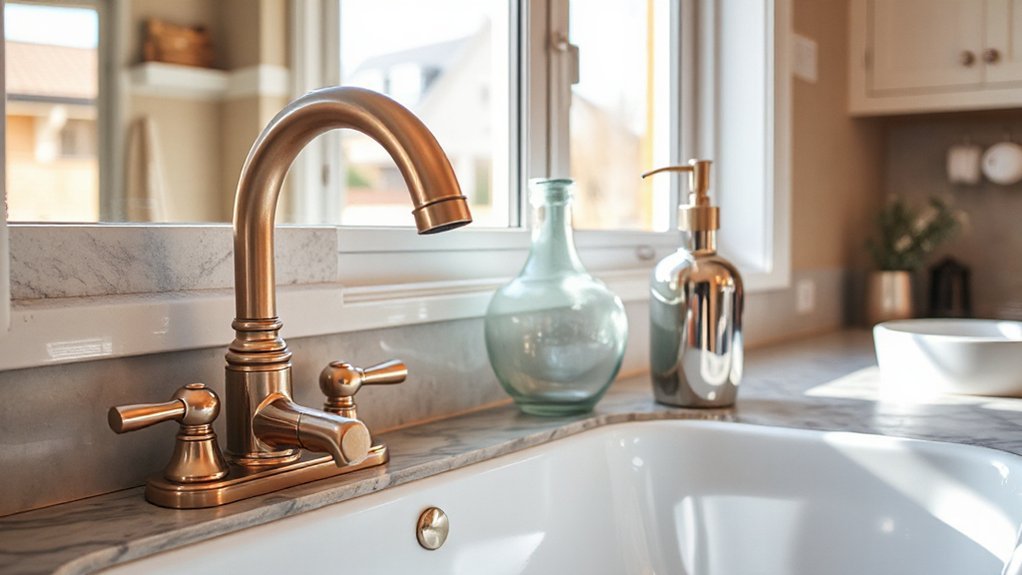
Brass, nickel, chrome, and black finishes each bring distinct properties to a kitchen or bathroom, making deliberate pairings more than a matter of aesthetics. You should evaluate each finish for corrosion resistance, reflectivity, and wear patterns, then align with usage zones and fixture materials. Brass offers warm undertones and patina development that can read as timeless, while nickel provides neutral balance with high durability. Chrome delivers bright, clean reflections suited to high-traffic areas, and black introduces contrast that anchors complex schemes. When combining finishes, limit metal groups to two or three hues and control texture to avoid visual clashes. Plan for metal patina and decorative accents to evolve together; specify protective coatings for high-contact surfaces to minimize maintenance and preserve function.
How Lighting Changes the Look of Metal Finishes
Lighting can shift how metal finishes read, so you’ll notice hue changes as bulbs glow and room color reflects off surfaces. The finish appears warmer or cooler depending on color temperature and intensity, altering perceived contrast with adjacent metals. Use controlled testing with your chosen fixtures to predict the final look before installation.
Lighting’s Metal Hue
When lighting interacts with metal finishes, the apparent hue shifts based on the light source, color temperature, and surrounding reflections. You’ll notice cooler lighting enhances chrome’s blue undertones, while warm light heightens brass’s amber notes. The color temperature you choose directly alters perceived metal finish tones, so select bulbs that align with your intended palette. Under high-CRI scenarios, true color rendering minimizes misleading shifts, helping you judge finish combinations accurately. Consider mixed lighting zones: task lighting may reveal a subtle grain, whereas ambient lighting can quiet or exaggerate contrast between metals. Keep fixture finishes consistent across rooms to reduce perceptual discrepancies. Finally, document your lighting plan, noting bulb type, wattage, and color temperature, so future updates preserve the intended metal hue and overall harmony.
Finish Shifts With Glow
Glow shifts are a practical concern because different light sources alter how metal finishes read. You’ll notice gloss, tone, and perceived warmth shift as lamps, daylight, and LEDs interact with your hardware. To manage this, evaluate finishes under representative lighting during selection, installation, and after adjustments.
- Compare metal polish variations under ambient and task lighting to gauge true tone.
- Test finish durability by cycling light sources and noting color drift, tarnish, or edge wear.
- Document acceptable shifts for each metal family to maintain cohesive contrasts.
- Reassess periodically after renovations or bulb changes to preserve intended aesthetics.
Keep notes on polish consistency and durability expectations; these factors determine long-term finish durability and overall metal harmony.
Grouping Rules: Where to Place Metals in Kitchens and Baths
Grouping metals in kitchens and baths should follow a practical, rule-based approach: group similar metals together, balance finishes by weight and brightness, and place high-contrast pairings where they won’t overwhelm or clash. You prioritize layout by function and sightline, aligning hardware, fixtures, and appliances to coherent metal families. Apply a dominant metal as the anchor, then support with complementary tones within a defined brightness range. Consider contrast only where it reads intentional, not accidental. Maintain consistent finish durability across high-use areas, and use accent metals sparingly to avoid visual noise. For maintenance, plan metal cleaning tips that target the chosen finishes without abrading protective coatings. Document placements and revisit after renovations to preserve a cohesive, durable, and low-maintenance kitchen or bathroom aesthetic.
Textures and Materials That Support Mixed Metals
Textures and materials should be chosen to cradle mixed metals without competing with them; think tactile contrast that enhances durability and function. You’ll prioritize surfaces that tolerate routine cleaning while supporting visual balance. Use material contrast techniques to separate metals without isolating them, reinforcing cohesion.
- Metal texture combinations: pair brushed with polished finishes to create subtle depth while maintaining legibility.
- Surface durability: opt hard-wearing substrates like quartz, porcelain, or dense stone for high-traffic areas.
- Edge and seam control: employ tight joints and consistent alignment to minimize visual clutter.
- Light interaction: choose matte versus glossy contrasts strategically to control glare and reflection.
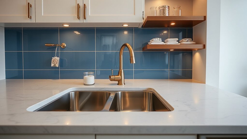
Hardware, Fixtures, and Appliances: A Cohesive Approach
You aim for a cohesive look by pairing hardware finishes that share a common undertone, whether warm, cool, or neutral. Coordinate fixtures and appliances so their finish families complement each other, not compete, across knobs, pulls, and trim. Start with a primary finish and reinforce it with controlled accents to achieve consistent metal pairing throughout the space.
Consistent Metal Pairing
To achieve a cohesive look, pair metals deliberately across hardware, fixtures, and appliances rather than treating them as separate decisions. You establish consistency by aligning finishes, textures, and tonal weight across every component, ensuring a unified impression at a glance. Focus on metal surface textures and color contrast techniques to guide choices without overcomplication.
- Select a dominant metallic base and echo it in at least one secondary element.
- Limit to two metallic tones to maintain visual harmony and reduce clash risk.
- Match drawer pulls, faucet trim, and appliance bezels by finish class (warm, cool, or neutral).
- Test contrast in controlled lighting to confirm readability and perception.
Adopt this method to achieve practical, repeatable cohesion from prep through plating and installation.
Hardware Finishes Coordination
Hardware finishes coordination requires deliberate alignment across cabinet hardware, fixtures, and appliances so the overall look reads as intentional and cohesive. You establish a unifying scheme by selecting a dominant finish and incorporating compatible accents for balance. Start with metal durability as a baseline, confirming each material can withstand daily use without noticeable wear. Assess finishes longevity under your environmental conditions, accounting for humidity, heat, and cleaning agents. Use a reference sample set to compare tarnish resistance, sheen, and color shift over time. Apply consistent hardware profiles where possible, or intentionally vary only within a narrow family to preserve rhythm. Document the chosen palette and install sequence to prevent mid-project deviations, and verify hardware alignment during final checks to guarantee precise gaps and level mounting.
Common Pitfalls and How to Fix Them
Common pitfalls arise when metals with different electrochemical properties come into contact in kitchens and bathrooms. You’ll identify corrosive interactions early and mitigate them with targeted fixes, preserving metal finish durability and minimizing upkeep through maintenance tips.
- Separate incompatible metals with protective barriers to prevent galvanic corrosion.
- Choose compatible pairing based on galvanic series to reduce potential-driven wear.
- Apply compatible sealants and clear coatings to deter moisture ingress.
- Schedule regular inspections for mounting hardware, fasteners, and seals, and perform timely maintenance.
- Maintain a consistent cleaning routine using non-abrasive products to avoid surface pitting.
- Refinish or replace worn finishes promptly to avert accelerated corrosion.
- Track humidity and venting to stabilize environments around fixtures.
- Document any color changes or staining for proactive repair planning.
Budgeting for a Balanced Metal Palette
Careful budgeting guides you toward a balanced metal palette that meets performance needs without overspending. Start by listing core fixtures first (sink, faucet, hardware) and assign a target finish for each, then quantify total material costs. Prioritize metal finish durability in high-use zones—kitchens demand abrasion and corrosion resistance, bathrooms benefit from moisture tolerance. Compare price-per-unit across stainless steel, brass, nickel, and bronze, focusing on durable coatings and compatibility with existing cabinetry. Allocate a contingency fund of 5–10% for unforeseen needs, and choose budget friendly material options that do not compromise essential performance. Use standardized finishes to minimize specialty parts, reducing lead times and installation complexity. Document procurement steps, confirm warranty terms, and track deviations to maintain budget control without sacrificing long-term value.
Quick Real-Life Swaps to Elevate Your Space
Swapping a few key metal elements can lift the look of a space fast and without a full remodel. You’ll gain immediate impact by matching finishes to existing fixtures, while preserving durability and function. Focus on finishes that balance metal durability with visual contrast, and choose eco friendly finishes where possible to reduce environmental impact.
- Swap cabinet hardware to a contrasting tone while preserving screw spacing and substrate integrity.
- Update lighting accents with a single-metal finish to unify ceilings, pendants, and sconces.
- Replace faucet and hardware in a coordinated finish, ensuring gaskets and seals remain compatible.
- Introduce a mixed-metal accent trim around backsplashes or mirrors for subtle depth without overloading the palette.
Frequently Asked Questions
How Many Finishes Should I Mix in One Room?
You should limit yourself to 2–3 finishes per room. Aim for finish consistency across metals, then vary texture instead of color. Emphasize metal pairing carefully, avoiding clashing tones; balance warm and cool undertones for coherent, practical results.
Can Metal Tones Affect Perceived Room Size?
Yes, metal tones can alter perceived room size. Reflective surfaces brighten spaces by bouncing light, while color contrast governs depth; lighter reflective metals visually expand, darker ones shrink. Use balanced contrasts to maintain accurate proportions and avoid crowding.
What’s the Best Metal for Allergy-Sensitive Spaces?
The best metal for allergy-sensitive spaces is surgical stainless steel or titanium; they’re hypoallergenic metal options with low nickel release. For metal allergy prevention, choose certified hypoallergenic finishes, avoid plating, and guarantee tight tolerances and proper ventilation.
How Do I Prevent Visible Fingerprint Issues on Metals?
“Like a shield, you’ll need fingerprint resistance coatings.” You prevent marks by choosing alloys with low oil attractance and applying durable finishes. Maintain metal regularly, clean with mild solutions, and inspect seals for wear—fingerprint resistance improves with metal maintenance.
Do Hardware and Fixtures Require Color-Matching Rules?
Yes, you should follow color-matching guidelines for hardware and fixtures. Use vintage accents with modern contrasts to create cohesive pairs, balancing finishes while preserving practical function and visual clarity across metals and surfaces.
Conclusion
You’ve learned that mixing finishes isn’t chaos; it’s a controlled, deliberate balance. By anchoring with a dominant metal and layering subtle accents, you can guide the eye without overcomplicating the palette. With thoughtful lighting, durable choices, and consistent documentation, your spaces read cohesive rather than cluttered. When a finish feels off, a gentle swap is a quiet upgrade, avoiding discord. In practice, finesse your contrast, test under glare, and preserve harmony as your project matures.