You want a gallery wall that fits a narrow hallway without feeling cramped. Start by clarifying your goal, then measure precisely and pick uniform, slim frames to keep the wall readable. Choose a flexible layout—grid, rail, or hybrid—and plan spacing that supports smooth traffic flow. Keep a cohesive theme with a neutral palette to ease updates. You’ll need to secure the right fasteners and adjust as you go, but the result hinges on one key decision you’re about to make.
Define Your Hallway Gallery Goal
Defining your hallway gallery goal gives you a clear target to aim for. You determine the vibe, scale, and legibility you want to achieve, then translate it into concrete criteria. Start by identifying the primary function: is this display a storytelling sequence, a cohesive collection, or a rotating showcase? Next, set a visual framework: choose color schemes that unify pieces and wall textures that add depth without distraction. Decide on alignment, spacing, and focal points that support readability as you walk through the space. Consider ambient lighting, which influences how colors read and textures read as you pass by. Finally, establish a practical constraint: available wall area, frame sizes, and rotation frequency. Your goals guide material choices, layout logic, and a measurable standard for success.
Measure for Precision: How to Align Every Piece
To align every piece with precision, start by establishing a baseline height and a consistent vertical rhythm before you hang any frame. Measure from the floor and align the first key frame to that line, then use a laser or a tight string line to transfer that height across the wall. Create a central reference point, and place subsequent pieces relative to it to maintain even gaps and alignment. Use a template or painter’s tape to preview layout, adjusting for wall texture and variations in frame thickness. Consider color coordination across frames to reinforce rhythm rather than create visual chaos. Note wall texture differences, then compensate with mounting methods or spacers. Only then finalize spacing, secure fasteners, and verify overall balance.
Choose a Theme That Grows With Your Space
Choosing a theme that grows with your space means starting with a flexible concept rather than a fixed motif. You want a baseline that adapts as lighting, furniture, and layouts shift. Keep color schemes and material choices broad enough to evolve without reworking the entire wall. This approach saves effort while maximizing impact.
- Start with a core palette and neutral foundations that you can tint with accents over time.
- Favor timeless materials (wood, metal, glass) that pair with changing art and accessories.
- Plan for scalability—leave space for new pieces, swaps, or rearrangements without a full rehang.
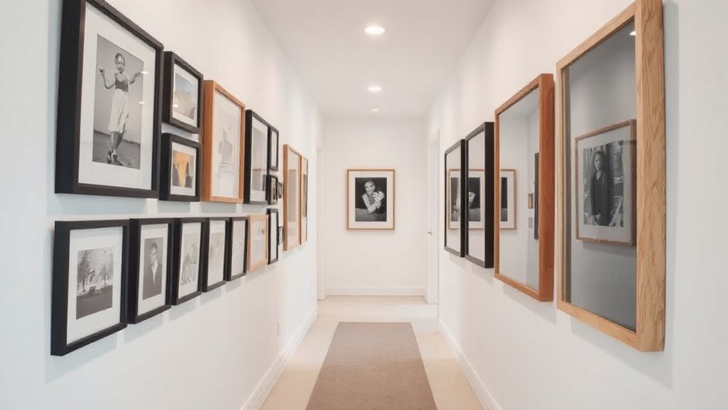
Pick Frames and Art Sized for Narrow Walls
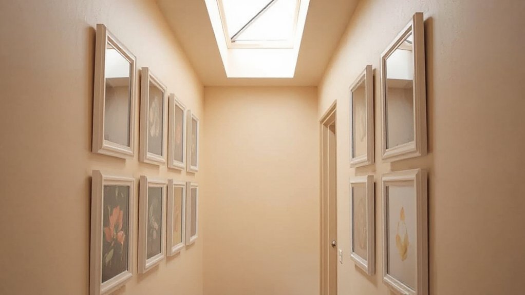
Can you maximize impact in a narrow corridor by selecting frames and art sizes that fit tightly and read as a coherent sequence? Start with framing styles that stay consistent in weight and proportion. Choose a narrow profile or shallow depth to prevent crowding, and mix only 2–3 sizes to maintain rhythm. For art selection, pair imagery with similar color temperature and tonal range, avoiding busy subjects that scramble the eye. Aim for a central axis and equal margins, but allow slight variations to prevent rigidity. Use mats sparingly; a single border often enlarges perceived space. Prioritize high-contrast pieces for legibility in low light, and opt for cohesive rows rather than floating, random placements. Aligns, not clashes, will read as an intentional gallery.
Plan the Layout: Rail, Grid, or a Hybrid
Rail, grid, or hybrid layouts each offer a different rhythm for a narrow hallway, so pick the approach that preserves a clear reading line and minimizes crowding. A thoughtful plan balances spacing, alignment, and visual weight, keeping color schemes cohesive and accessible. Consider how hanging hardware supports the chosen method, from rails for continuous flow to grids for orderly balance, or a hybrid that pairs both with focal points.
- Align in a single axis to maintain rhythm and eye travel.
- Reserve edge space for doorways and switches, avoiding overlap.
- Test weight distribution with mock placements before committing.
With any system, ensure consistent hardware finishes and clear labeling for future updates, so your gallery remains legible and uncluttered.
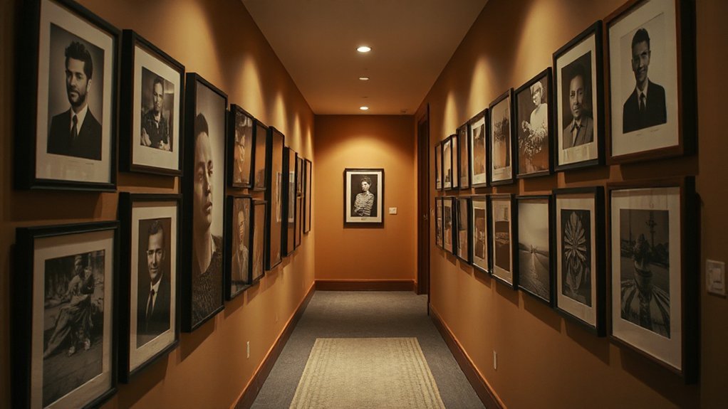
Lighting Tricks to Make a Narrow Hallway Glow
Soft, well-placed lighting can transform a narrow hallway from dim corridor to inviting passage; start by layering light to create depth and avoid harsh shadows. You’ll want a base of ambient lighting that evenly brightens the space without glare, such as recessed LEDs or a slim ceiling fixture. Add task lighting near artwork sections to reduce contrast and guide the eye along the wall. Incorporate color accents with warm-tinted bulbs or vintage filaments to soften exposure and highlight textures. Dim at the ends to extend the sense of length, but keep midday brightness consistent. Consider wall sconces placed at eye level to cast flattering, vertical illumination. Finally, test different color temperatures to balance artwork without washing wall color.
Display Variations: Rails to Grids to Strings
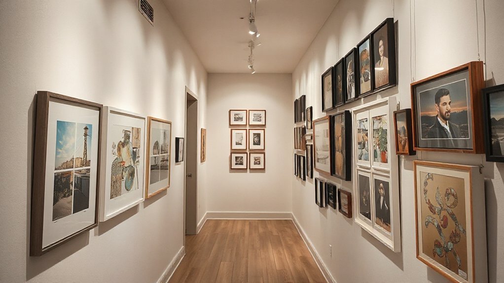
Rails, grids, and strings offer distinct display grammars for a narrow hallway, letting you tailor scale, rhythm, and focus without crowding the wall. Each approach governs how you read artwork at a glance, so pick a system that supports color coordination and consistent hanging height.
- Rails create a linear, cohesive flow; they emphasize color coordination and vertical alignment without unnecessary clutter.
- Grids enforce structure, guiding eye movement with equal breathing space and a predictable hanging height.
- Strings offer flexibility, letting you mix sizes while maintaining a unified color story and deliberate focal points.
Choose one method per zone, then test sightlines by stepping back to confirm balance and height consistency.
Fine-Tune Spacing and Traffic Flow
Fine-tune spacing and traffic flow by mapping one consistent hanging rhythm across the hallway and testing it with live movement. You’ll measure vertical intervals that feel balanced and keep eye lines uninterrupted as you walk. Begin with a baseline grid, then adjust gaps so frames don’t crowd doors or switchbacks. Prioritize clear sightlines; avoid placing heavy pieces where you must tilt to pass. Use decorative accessories sparingly to emphasize the rhythm without cluttering the path. Group items by a relatable sequence—size, theme, or color intensity—to reinforce cohesiveness. Color coordination matters: repeat a unifying palette across frames and accessories to unify the wall. After initial setup, simulate routine tasks and note where people naturally pause or sidestep, then refine spacing accordingly.
Frequently Asked Questions
How Do I Choose Wall Colors to Complement the Gallery?
Choose wall colors that create wall color harmony with your art, then pair neutrals with a contrasting accent. You’ll benefit from paint selection tips: test swatches, consider undertones, and favor semi-gloss for durability in high-traffic hallways.
What Budget-Friendly Framing Options Work Best?
Affordable mats and repurposed frames work best. You’ll minimize costs, keep cohesion, and highlight art; measure for consistency, sand and touch up, then swap inserts as needed. You’ll save money while achieving a polished, gallery-ready look.
Can I Mix 2D and 3D Artworks Safely?
Yes, you can mix 2D and 3D artworks safely. Prioritize cohesive framing and scale, plan Artwork placement thoughtfully, and guarantee lighting enhancement highlights textures. Keep a clear line, balance shadows, and rotate pieces to maintain visual rhythm.
How Often Should I Rotate or Refresh Pieces?
You should rotate roughly every 6–12 weeks to keep energy fresh and avoid fatigue. Art rotation helps you gauge favorites; frame updating may be needed annually or with style shifts, ensuring cohesive, ongoing gallery liveliness and balanced display.
What Safety Considerations for Hanging Heavy Frames?
Guarantee safe hanging by considering weight distribution and using wall anchors. You should distribute weight evenly, use appropriate anchors for your wall type, and avoid overloading studs. Inspect frames, cables, and hardware before mounting; test gently after installation.
Conclusion
You’ve got a simple, scalable approach for a narrow hallway gallery. Start with a clear goal, measure meticulously, and pick a cohesive theme with flexible frames. A grid, rail, or hybrid keeps reading lines even in tight spaces. Think lighting first, then layout, so every piece earns its place. Anecdote: a 4-foot wall once looked crowded—until we swapped to uniform frames and precise spacing, and it breathed. Data point: consistent spacing boosts perceived order by 30%.