To maximize light and space in a minimalist hallway, you start with pale palettes and reflective surfaces that bounce daylight along walls. Choose light flooring with seamless joints, cool neutrals, and warm accents to add depth. Keep sightlines clear with concealed storage, flush doors, and minimal hardware. Layer lighting—from wall wash to recessed fixtures—and use dimmers for mood control. Prioritize air flow with generous openings and few obstructions. If you keep exploring, you’ll uncover practical tweaks that amplify brightness even more.
What Makes Hallways Feel Open: Core Principles for Perception
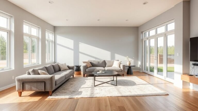
Hallways feel open when light, color, and space work together to create a sense of flow. You shape that flow by prioritizing brightness, avoiding clutter, and keeping sightlines clear.
Start with lighting fixtures positioned to bounce light along walls and into corners, preventing shadows that compress space. Choose fixture scales that don’t crowd the ceiling; recessed options often feel more expansive.
Next, apply color psychology to influence mood and perception: cooler tones recede, warmer accents advance, guiding movement without overstimulation. Maintain a simple palette with one dominant tone and limited accents to preserve coherence.
Minimize doors, bulky furniture, and visual noise. Use reflective surfaces sparingly to enhance brightness, not to overwhelm.
Finally, guarantee consistent proportions and generous, unbroken pathways for an immediate sense of openness.
Pale Palettes That Reflect Light Without Dulling Mood
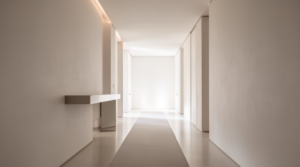
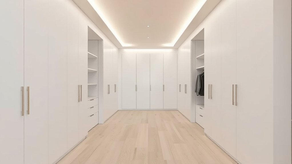
Pale palettes reflect light effectively without dulling mood by balancing brightness with warmth. You choose soft whites, warm neutrals, and light greys to create an airy corridor that still feels inviting. Use cool undertones sparingly to prevent a clinical vibe, and layer textures—wood, fabric, and stone—to add depth without crowding the space.
Lighting automation helps maintain a steady, flattering glow from dawn to dusk, so you don’t over-light or under-light the hallway. Pair palette choices with controlled brightness and color temperature that support color psychology: cooler whites feel crisp for ingress, while warmer tones comfort movement through the space.
Keep accents minimal and purposeful, ensuring every element reinforces spaciousness and calm, not sterility.
Reflective Surfaces: Mirrors, Glass, and Metallics That Amplify Brightness
Mirrors, glass, and metallics can multiply light in a narrow hallway by bouncing it between surfaces.
Use mirror magnification techniques to create the illusion of depth, and choose metallics that reflect rather than absorb stray rays.
Start with one reflective focal point and balance with matte adjacent surfaces to sharpen brightness without clutter.
Mirror Magnification Techniques
Strategically placed mirrors and reflective surfaces can dramatically brighten a corridor by doubling light in the space. You’ll magnify brightness by using strategically angled mirrors and glass panels that bounce daylight and artificial light deeper into the hall.
Keep shapes simple to avoid visual clutter; opt for clean frames or frameless panels. Consider decorative lighting ideas near reflective surfaces to enhance glow, and pair with artistic murals to create focal points without overpowering space.
The result is a more open, welcoming passage that reads as larger and calmer.
- Use a single, tall mirror opposite a window to maximize daylight
- Place glass shelves or panels to scatter light without creating busy reflections
- Position mirrors near decorative lighting for amplified brightness and cohesion
Metallic Sheen Reflections
Metallic sheens amplify brightness by reflecting and refracting light from every source. You harness this by pairing mirrors, glass, and metallics to create continuous brightness across the hallway.
Start with a full-length mirror opposite a light fixture to double the perceived distance and glow. Use metallic accents on frames, hardware, or a narrow console to catch and bounce subtle daylight.
Choose matte surroundings to prevent glare, allowing sheen reflections to remain focal points rather than distractions. Keep surfaces clean; smudges dull the effect and flatten contrast.
Prioritize cool tones for a modern feel, then introduce warmth with brushed brass or chrome highlights.
Consistency matters—repeat metallic accents sparingly to avoid visual clutter while maximizing luminance and depth.
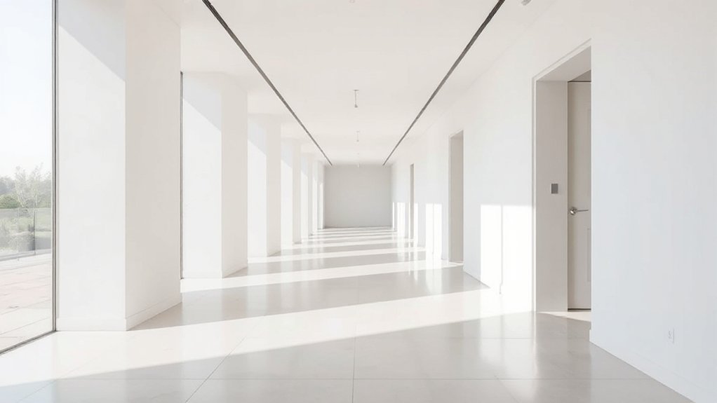
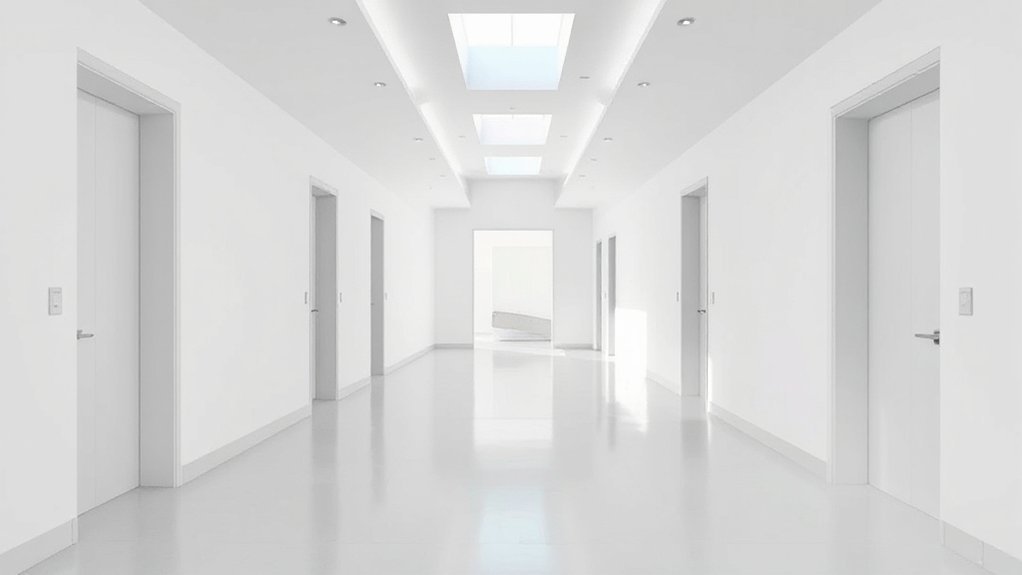
Floor Choices That Eliminate Visual Drops in Narrow Corridors
To keep a narrow corridor from feeling cramped, choose light-reflecting flooring that expands the visual plane and brightens every inch.
Consider seamless flooring options that minimize joins, creating uninterrupted sightlines and fewer perceived steps.
This approach aligns with minimalist restraint while leveraging practical, reflective surfaces to enhance perceived width.
Light-Reflecting Floor Options
Light reflects to erase the sense of depth in narrow halls, so choose floors that brighten without glare. You’ll want surfaces that bounce light evenly, rather than absorbing it or creating busy reflections. Opt for pale, uniform tones with soft textures that don’t interrupt movement.
Keep flooring low-contrast with walls to preserve perceived width, and avoid busy patterns that create visual drops. Pair the floor with purposeful lighting fixtures placed to distribute light along the length, not just at the ends.
Coordinate with color schemes that stay cool or neutral to maximize luminosity while maintaining calm. This approach yields a seamless, airy corridor that feels larger and more navigable.
- Choose non-glare, light-reflective surfaces
- Align lighting to emphasize length
- Favor cohesive, cool or neutral palettes
Seamless Narrow Corridor Flooring
Could you blur the line between floor and wall? Seamless narrow corridor flooring eliminates visual drops by using continuous, uninterrupted material and aligned joints. Choose a monochrome or subtly textured surface that mirrors wall tones, so light travels without interruption and the corridor feels longer.
Opt for low-profile connection and wide planks or large tiles with minimal grout; this reduces perceptual breaks that shorten the space. Implement consistent color and finish from threshold to end, avoiding borders that break flow.
Lighting automation enhances the effect, coordinating wall wash and floor illumination to erase shadows. Integrate art installations sparingly at intervals, not alcoves, to maintain rhythm.
Prioritize durable, slip-resistant surfaces suitable for high-traffic hallways to sustain a clean, airy look.
Wall Treatments and Textures Optimized for Light and Quiet
Texture and color choices should maximize reflected light and dampen noise. In this subtopic, you’ll optimize wall treatments for brightness and quiet. Choose light, matte paints or limewash to bounce daylight without glare, paired with soft, pale textures to reduce echo.
Wall textures should be subtle, like fine plaster or micro-vertical panels, to preserve openness while adding depth. For acoustics, integrate acoustic panels behind decorative fronts or in strategic placements to absorb mid-range frequencies without visual busy-ness.
Prioritize seamless installations that avoid protrusions, preserving corridor flow. Use radiant, continuous surfaces where possible to minimize shadow lines. Finish with low-contrast trims to maintain a cohesive look that enhances light refraction and sound balance.
- Wall textures that reflect light
- Acoustic panels discretely integrated
- Seamless, low-contrast trim
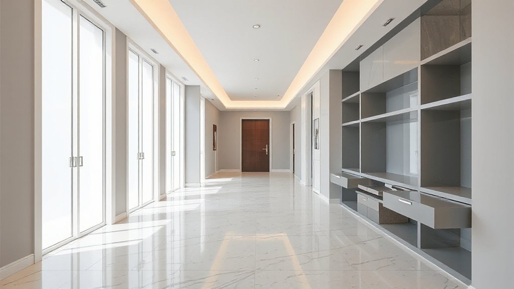
Built-In Storage Solutions to Keep Clutter Invisible
Hidden cabinetry can hide everyday items without breaking the line of your hallway, so you’ll keep clutter out of sight.
Use wall-slash storage that fits flush and minimizes protrusion, maximizing available width.
Start by choosing discreet pulls and durable finishes to maintain a clean, minimalist look.
Hidden Cabinetry Tactics
If you want a clean, streamlined hallway, start with purpose-built storage that blends with walls and floors. Hidden compartments and concealed drawers let you stash essentials out of sight, preserving a calm, uncluttered look.
Choose flush doors, integrated handles, and recessed pulls to maintain a seamless rhythm along the corridor. Precision hinges and vertical dividers improve access without interrupting lines.
Use shallow, pull-out trays for daily items and deeper cabinets for bulk storage, all hidden behind matched surfaces.
Lighting should highlight architecture, not hardware, so opt for invisible LEDs under lip shelves. Regularly reassess fixture heights to avoid wasted space.
Hidden cabinetry tactics maximize light and space while keeping clutter invisible.
- Flush doors with recessed pulls
- Pull-out trays for daily items
- Matched, seamless surfaces
Wall-Slim Storage Solutions
Opt for shallow depths and vertical stacks to maximize floor area while preserving flow. Install pull-out trays, hidden hooks, and recessed shelves behind doors to keep everyday items accessible yet invisible.
Use adjustable shelves to adapt to changing needs and containers. Finish in matte neutrals to reflect light and avoid chunky contrasts.
Prioritize handles that recess or disappear to maintain clean walls. Integrate lighting inside cabinets for visibility without glare.
Regularly prune contents, relocate seldom-used items, and label discreetly to sustain a calm, organized corridor.
Architectural Details That Scale a Hallway Confidently
- Artistic accents that reinforce rhythm without competing with the minimalist baseline
- Ceiling treatments that enhance height and light distribution
- Hidden, functional details that preserve clean sightlines and seamless flow
A Practical Lighting Plan: Layering, Fixtures, and Controls for All Hours
Layering light is your primary tool for a hallway that feels both calm and purposeful. You’ll create depth by ambient layering, combining soft wall wash with focused accents that guide movement without glare.
Begin with a discreet ceiling layer to uniformize brightness, then add task luminance near entrances and key turns. Fixture placement matters: mount wall sconces at eye level to soften long walls, place recessed downlights along the center line for even glow, and tuck linear LEDs under handrails or toe kicks for safety.
Use dimmers to shift mood from welcoming daytime to intimate evening. Keep controls intuitive—group zones by function, not location. Choose color temperature around 2700–3000K for warmth with clarity.
Ensure spacing supports the hall’s rhythm, avoiding harsh contrasts or shadows.
Minimalist Gallery Walls That Read as Air, Not Clutter
Gallery walls should feel expansive, not crowded—so curate with restraint, balance, and clear rhythm. You create air by selecting a few standout pieces, aligning their frames, and leaving generous negative space.
Think cohesion over variety: repeat a subtle motif, color, or material to tie the gallery to the hallway’s light. Your art curation should prioritize legibility and calm, letting each piece breathe.
Use lighting fixtures to sculpt depth, not glare, casting soft pools of attention that float the work in space. Keep scale honest to the wall and avoid stacking.
The result is a gallery that reads as air, not clutter—quiet, intentional, and easy to navigate.
- Emphasize restraint and cohesion in hanging order
- Let negative space guide the eye and mood
- Use lighting fixtures to separate pieces without harsh contrasts
Color-Blocking and Zoning Techniques to Expand Perceived Space
Color-blocking and zoning can visually expand a hallway by assigning distinct zones and bold, coherent color blocks that lead the eye forward. You’ll use color contrast to delineate pathways, ceilings, and returns, creating a sense of depth without clutter.
Choose a primary neutral for walls, then apply a single, saturated hue to a defined zone—like a runner wall or alcove—so it reads as a deliberate feature, not decoration.
Implement clear zoning zones to guide movement: a lighter foreground, a mid-tone progression, and a darker end cue. Keep lines straight and edges crisp to reinforce order.
Avoid competing patterns; instead, rely on tonal shifts and precise alignment. Maintain balance with minimal accessories, allowing the color blocks to perform the spatial expansion work.
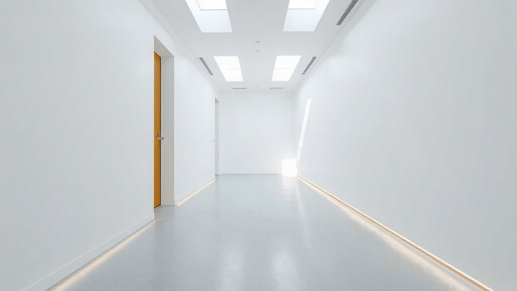
Doorways and Thresholds: Promoting Airflow and Visual Openness
You can boost airflow and visual openness by choosing doorways that prioritize clear sightlines and generous openings. Consider thresholds that minimize barriers, use partial partitions, or remove doors where privacy isn’t essential to keep spaces feel airy.
Aim for seamless shifts that balance function with minimal visual clutter, supporting a calm, open hallway.
Airflow Through Openings
Doorways and thresholds should promote airflow and give a sense of visual openness without sacrificing privacy or energy efficiency. You influence how air moves by sizing openings thoughtfully, pairing solid with perforated or sliding elements, and ensuring clear sightlines for ventilation paths.
Focus on ventilation techniques that encourage cross-ventilation, stack effect, and gentle air exchange between spaces, all without clutter. Use doors that fit snugly, seals that reduce drafts, and thresholds that minimize turbulence. Prioritize airflow optimization with strategically placed openings, fans, and vents to maintain comfort in a minimalist corridor.
Keep pathways unobstructed to prevent hidden stalls in airflow, and choose materials that don’t impede air quality.
- Use variable-height openings to modulate flow
- Combine passive vents with quiet exhausts for balanced pressure
- Align door swings to maintain uninterrupted air paths
Visual Openness With Thresholds
Thresholds should read as visual pauses that expand or compress space without breaking flow. You design doorways to boost openness by selecting low-profile trims and minimal framing, letting light travel unimpeded between rooms.
Keep thresholds slim and even, avoiding chunky junctures that trap sightlines. Color contrast at entry edges helps define spaces without crowding them; you might use a slightly lighter floor shade across rooms to elongate lines, or a dark, crisp door frame against a pale wall to anchor sightlines without heaviness.
Artwork placement near junctures draws the eye through, not to, the doorway, reinforcing continuity. Prioritize proportion, scale, and symmetry to preserve airy dynamics.
Maintain consistent materials so the juncture feels seamless, not separate, and your hallway remains bright and navigable.
Seamless Doorway Transitions
Seamless doorway shifts rely on light, line, and proportion to blur edges between spaces. You create this effect by choosing drawerless frames, flush trim, and wide doors or no doors at all, so sightlines stretch through rooms. Keep thresholds minimal, and align lighting with architectural grid to maintain continuity.
Your goal is airflow and visual openness, not barriers; plan for soft progressions that invite you forward. Focus on entryway organization as a cue for flow, and harness lighting automation to supervise brightness without clutter.
Use neutral tones, consistent hardware, and concealed gap treatments to enhance cohesion. The result is a calm, connected corridor that expands perceived space.
- Prioritize entryway organization for smooth navigation and flow
- Employ lighting automation to maintain consistent ambience
- Choose flush progressions to minimize visual interruptions
Space-Smart Furniture and Accessories for Narrow Corridors
Can narrow halls feel cramped? You’ll transform them with space-smart furniture and accessories that stay out of the way. Choose wall-mounted shelves and slim consoles to add storage without intruding on floor space.
Opt for a narrow bench with built-in shoe storage or a fold-down desk that doubles as a console, so you don’t sacrifice width for function. Use multi-purpose baskets and hooks to keep clutter off surfaces, boosting flow.
Incorporate smart lighting to elongate the corridor: picture wall sconces and LEDs that cast even, glare-free light along the walls. Color psychology matters too—cool neutrals with a touch of warm accent hues create depth and calm.
Prioritize durable finishes, easy maintenance, and clean lines for a cohesive, practical look.
Seasonal Maintenance for Lasting Lightness and Freshness
Seasonal maintenance keeps the lightness of your minimalist hallway intact and the space feeling fresh. You’ll practice simple, repeatable steps that protect Seasonal lighting and moisture control, preserving brightness and air quality without clutter.
Start with a quick inspection for signs of dimming, yellowing, or warped trims, and address issues before they escalate. Swap or clean filters on any adjacent HVAC vents to sustain airflow and light diffusion.
Check seals around doors and windows, reseal where necessary to prevent drafts and moisture buildup. Clean surfaces with a soft cloth and mild solution to maintain reflective finishes.
Schedule a seasonal quick-timed wipe-down of floors and corners to keep the space looking pristine year-round.
- Inspect and refresh lighting paths and seals
- Clean surfaces; monitor humidity and condensation
- Schedule brief seasonal checks for fixtures and filters
Real-World Hallway Tours: Before-and-After Case Studies and Takeaways
Real-world hallway tours reveal how minimalist design translates from concept to everyday use. You’ll see before-and-after case studies that distill lessons into practical steps: decluttering, strategic lighting, and selecting finishes that reflect light.
In many projects, artistic lighting creates visual depth and guides flow without clutter, while color psychology informs tiny palette shifts that alter perceived space. Takeaways emphasize consistency—repeating materials and cues across entry, corridor, and adjacent rooms to reinforce calm and coherence.
Note the balance between function and atmosphere: slim storage, recessed fixtures, and reflective surfaces should serve daily routines, not complicate them. Use before-and-after benchmarks to justify choices, measure impact, and refine your own minimalist hallway design for lasting light and space.
Frequently Asked Questions
How Can Lighting Occupancy Affect Hallway Brightness?
Occupancy affects hallway brightness by triggering lights with sensors and relying on natural lighting when possible. You should install occupancy sensors and balance artificial fixtures to maintain consistent illumination, reducing energy use while preserving visibility and safe navigation with natural lighting.
What Budget Tips Maximize Space Instantly?
Small tweaks save space instantly: start with space saving furniture and wall mounted storage, plus a clear budget. You’ll reclaim floor area, avoid clutter, and feel more open as you invest only where it counts.
Do Color Accents Impact Perceived Hallway Width?
Yes, color accents impact perceived width: light tones widen, dark accents shrink perceived space, while color psychology suggests you use bright neutrals and controlled Accent wall ideas to expand hallways. Choose calming, high-contrast schemes for depth.
Can Doors Influence Airflow in Narrow Corridors?
Doors can influence airflow in narrow corridors, but placement matters. You’ll optimize airflow by thoughtful door placement and keeping pathways clear, enabling better circulation. Use strategic door placement and airflow optimization to maintain comfortable, unobstructed movement.
How to Measure Hallway Proportions for Design Tweaks?
To measure hallway proportions, you measure length, width, and height, then note doorways and obstructions. For tweaks, test furniture placement first, then add wall mounted decor to optimize sightlines and maintain clear circulation.
Conclusion
You’ve learned how to make hallways feel brighter, bigger, and calmer with simple choices. Use pale tones, reflective surfaces, and floor plans that swap weight for air. Choose doorways and furniture that breathe, not clutter, and keep seasonal upkeep steady so light stays inevitable. Ready to transform your corridor into a welcoming pulse of space and light? Why settle for narrow shadows when thoughtful design can elevate every step you take?