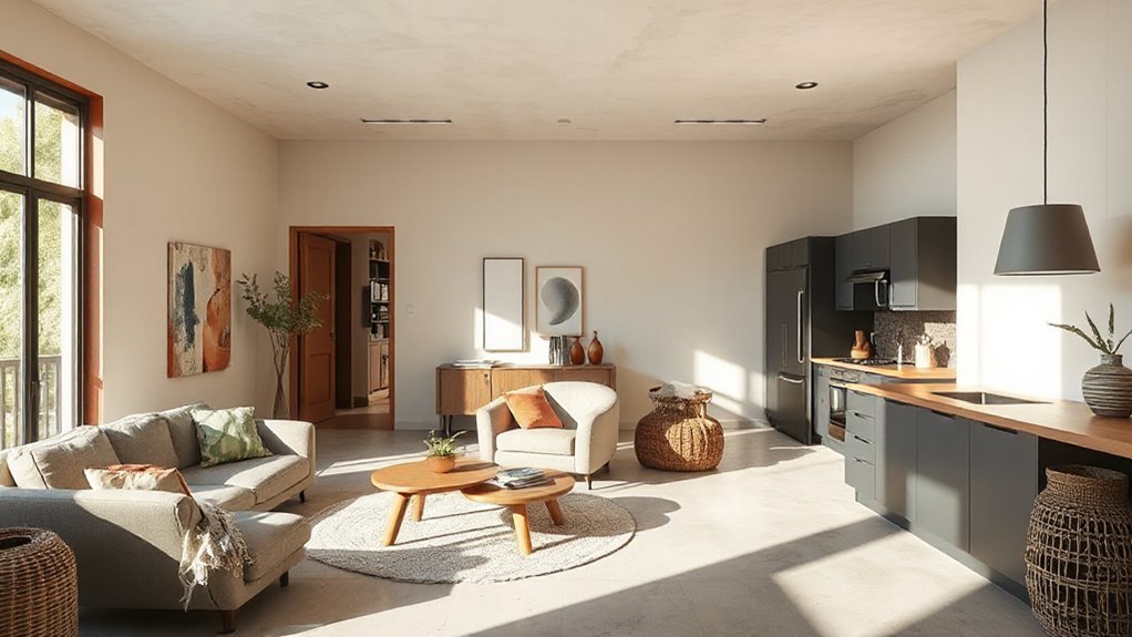
Open-plan color schemes work like a single canvas with zones, starting from a restrained base and layering with textures and accents. Use misty neutrals for calm grounding, add earthy terracotta for warmth, and pepper in bold canary yellow against moody charcoal for anchors. Weave finishes—brick, wood, metal, fabric—so depth stays refined. Zone with hue and value, not walls, and keep lighting consistent to preserve color. If you keep exploring, you’ll discover more practical details and tweaks.
How Open-Plan Color Schemes Really Work
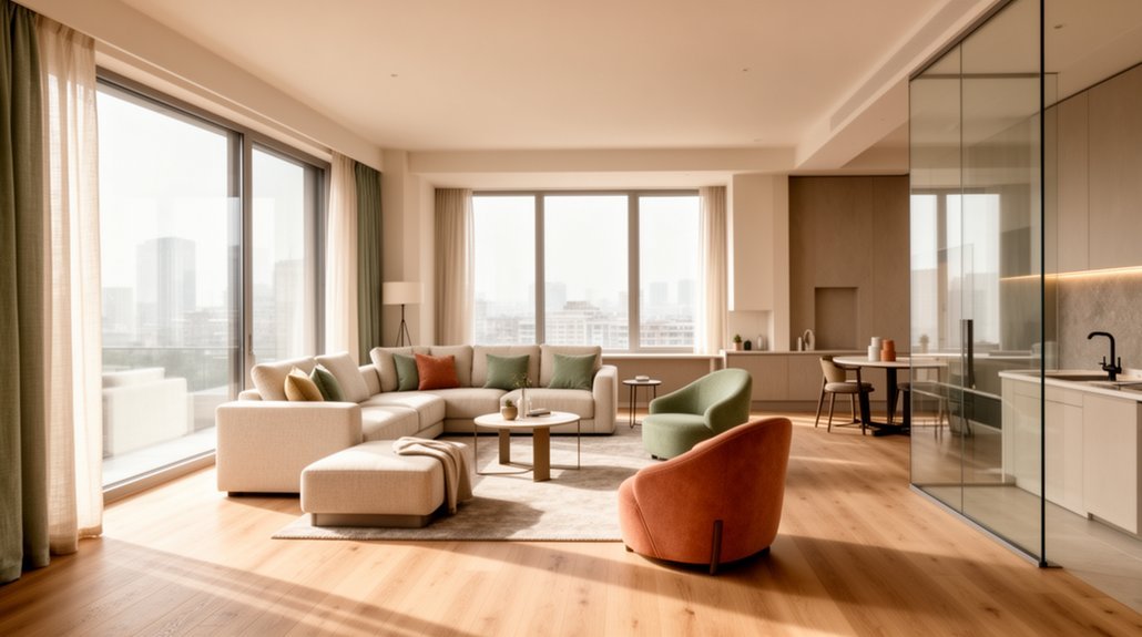
Open-plan color schemes work best when you treat the space as a single canvas with zones. You balance color by defining purposefully distinct zones while keeping a unified backdrop. Start with a restrained palette for walls and larger surfaces, then layer with accent hues to cue different activities.
Use color psychology to steer mood: cooler tones can calm living areas, warmer tones energize dining or work hubs, and midtones anchor circulation. Maintain spatial harmony by repeating key hues, textures, and materials across zones, so transitions feel seamless rather than separate rooms.
Consider contrast for readability and flow, not drama. Test lighting at different times of day, because color shifts under artificial and natural light.
Finally, keep a clear hierarchy: base, accents, and occasional pops to sustain coherence.
Misty Neutrals and Earthy Terracotta for Calm Grounding
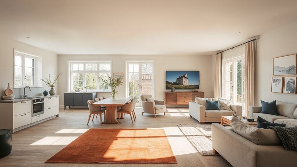
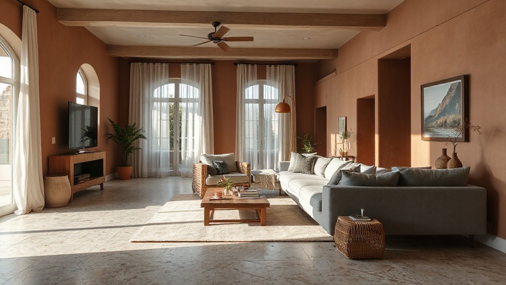
Misty neutrals and earthy terracotta create a calm grounding that anchors open-plan spaces without dulling them. You’ll achieve a serene backdrop by pairing soft grays, creams, and taupes with warm terracotta accents.
Use low-saturation tones to reinforce a cohesive flow, reserving terracotta for focal pieces like a sofa, rug, or art frame. Color psychology supports this mix: neutrals soothe activity zones, while terracotta adds warmth and sensory depth that encourages conversation and steadies movement through the plan.
Cultural symbolism matters, too—terracotta echoes earthiness and craft, subtly signaling hospitality and grounded design. Keep surfaces uncluttered, switchable lighting, and textured textiles to deepen tactility.
This approach delivers calm grounding without sacrificing modernity or practicality.
Bold Accents: Canary Yellow and Moody Charcoal for Contrast
Bold accents can transform an open-plan by delivering high-contrast focus where you need it most. You pair canary yellow with moody charcoal to create instant visual anchors that guide movement and highlight key zones.
Use canary yellow for furniture silhouettes, cushions, or statement lighting to inject energy without overwhelming the space. Balance with moody charcoal on walls, shelving, or cabinetry to ground the brightness and add sophistication.
In practice, keep color blocks disciplined: limit yellow to two or three elements per zone for clarity. Textures matter; matte charcoal surfaces reduce glare, while glossy yellow accents catch the eye without dominating.
This combo delivers crisp, modern contrast that remains versatile across different materials and lighting conditions.
Layer Textures to Deepen Color in Open Spaces
Layer textures layer in color by mixing finishes—think brick, wood, fabric, and metal to deepen the palette without loud contrasts. Start with a base tone and introduce varied textures to create subtle shifts in depth and warmth.
This texture mix in open spaces helps you control perception of color across different light conditions and zones.
Layered Textures, Deeper Color
Textures layer color by adding depth and warmth to open spaces. You’ll combine layered textiles, surfaces, and finishes to create a cohesive tonal story without flattening the room.
Start with a base color set and introduce varied textures—linen, wool, wood, matte metal—to build visual depth. Prioritize textural contrast: juxtapose smooth painted walls with tactile fabrics or ribbed textiles to anchor furniture and zones.
Use color psychology as a compass: deeper hues can ground areas, while lighter textures lift and expand. Keep patterns restrained; let subtle texture shifts do the work.
Balance sheen and matte finishes to control light diffusion. In practice, test swatches in natural light and align textures with traffic flow, ensuring comfort, durability, and a unified, dynamic open space.
Texture Mix for Open Spaces
Texture mix in open spaces deepens color by layering varied materials—linens, wools, woods, metals—so the room reads as a cohesive, dynamic whole. You combine textures purposefully to add dimension without clutter.
Begin with a base palette and introduce tactile layering through fabric weights, surface finishes, and material scales. Aim for textural contrast between soft and hard elements, matte and gloss, warm and cool tones, to guide the eye and create subtle focal points.
Use natural fibers for warmth, metal accents for edge, wood for grounding, and stone for durability. Maintain balance by repeating a few key textures across zones, ensuring flow stay seamless.
Prioritize practical durability in high-traffic areas, and test lighting to reveal true texture.
Color-Driven Zoning: Practical, Connected Space Strategies
Color-driven zoning uses hue, saturation, and value to delineate functions without walls. You define zones by color, then guide traffic with contrast and harmony, not barriers. Begin with a neutral base to keep spatial flow intact, then assign accent colors to active areas like the work zone or dining strip.
Use consistent saturation rules so progressions feel intentional rather than abrupt. Color harmony matters: pair analogous tones for cohesion, or contrast complementary hues for clear function cues. Keep values varied enough to read depth and movement, but avoid clashing statements that interrupt the rhythm.
In practice, test small swatches on walls and furniture at eye level, then observe how the room feels from multiple vantage points. Adjust until zoning reads clearly while preserving openness and breathable, connected space.
Lighting and Materials to Preserve Color Across the Space
To keep color true across open spaces, prioritize lighting consistency from room to room and adjust for spectral balance as layouts change.
Choose materials with reliable reflectivity and color keepers—flat whites, neutral midtones, and controlled sheens—to minimize drift under different lights.
Align light sources and finishes early, so color perception stays cohesive as spaces open up.
Lighting Consistency Across Spaces
Achieving lighting consistency across spaces requires selecting fixtures and materials with matched color temperatures and rendering accuracy. You’ll maintain ambient illumination that feels cohesive from room to room, avoiding abrupt shifts in hue. Guarantee color harmony by standardizing CRI on all fixtures and choosing lamps that render at similar spectral power distributions.
Keep glare minimal and luminance levels consistent to protect perceived color accuracy.
- Choose fixtures with identical color temperatures across zones.
- Match CRI values and verify rated rendering on-site.
- Use dimmable, uniform-output fittings for smooth transitions.
- Audit subsystems (recessed, pendant, under‑cabinet) for consistent warmth.
Material Reflectivity and Color Keepers
For walls, opt for matte or low-sheen paints to minimize glare and color shift from adjacent lighting. Surfaces with higher reflectivity, like soft-finish plaster or satin paints, can brighten zones without washing out saturation when paired with steady lighting.
Introduce color keepers—materials that resist fading, like UV-stable fabrics and pigment-rich laminates—on key furniture and partitions to preserve tonal intent.
Test textiles under the planned lighting, then calibrate bulbs toward the spectrum that sustains your palette. Regularly review wear, recoat where necessary, and maintain consistency across zones.
Frequently Asked Questions
How Do Trends Stay Timeless in Open-Plan Homes?
Trends stay timeless in open-plan homes when you focus on Color psychology and Design continuity. You choose cohesive palettes, layered neutrals, and adaptable accents, ensuring light, scale, and function remain consistent as spaces evolve over time.
Which Color Schemes Suit Small Open-Plan Spaces?
Color psychology shows lighter grays and soft taupes expand space; you should pair cool neutrals with warm wood. You’ll boost perceived room size, and guarantee furniture coordination for flow, scale, and cohesive color without overwhelming the open plan.
What Are Budget-Friendly Ways to Refresh Color?
You can refresh color on a budget with simple paint techniques and budget accessories. Prioritize washable finishes, upgrade a single accent wall, and swap textiles. Add mirrors for brightness, then layer affordable accessories to finish the look.
How Do Color Choices Affect Acoustics and Mood?
Color choices influence acoustics: choose materials with sound absorption to reduce echo, and fabrics or soft furnishings to dampen noise. They also shape mood: lighter tones boost energy, but warmer hues cultivate calm and a favorable Psychological impact.
Can Color Influence Perceived Room Height in Open Plans?
Yes, color can influence perceived room height in open plans. Use cool, light tones on walls and lighter ceilings, contrasts with darker accents. Color psychology and visual perception guide you to visually elevate ceilings and create spaciousness. Think airy, balanced interiors.
Conclusion
You’ll wrap an open-plan with confident, cohesive color choices. Start with misty neutrals and earthy terracotta for calm grounding, then lift the space with bold accents like canary and charcoal to create contrast. Layer textures to deepen the palette, and use color-driven zoning to keep zones connected. Pair fixtures and materials that preserve color flow across areas, so light travels smoothly. It’s like painting a single, living canvas—purposeful, practical, and utterly unified.