This year, you’ll notice UK interiors leaning into tangible, material-driven warmth—think wood, stone, and woven textures that feel crafted and enduring. Pair these with flexible storage, smart lighting, and layered textiles in earthy neutrals, and the result is calm, usable spaces that still spark personality. The trend isn’t about flash; it’s about longevity and regional nuance—from Glasgow’s urban minimalism to Brighton’s coastal ease—which means your space can evolve with you. Ready to see how it could work for you?
Why UK Interiors Feel Tangible This Year
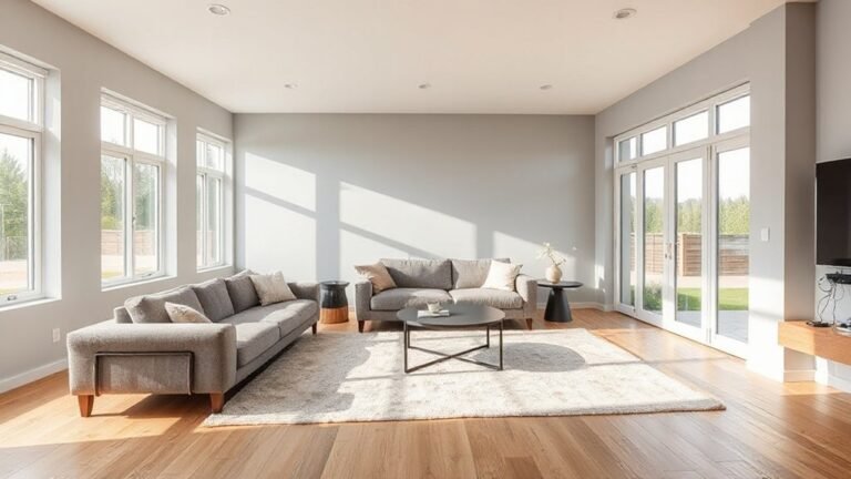
You’ll notice UK interiors feel tangible this year because materials, textures, and lighting have moved from aesthetics to everyday experience. You engage with spaces that feel practical yet refined, where tactile surfaces reward you with authenticity.
The trend hinges on historical influences translating into contemporary form, so you sense stories embedded in wood grain, patina, and stone. Regional craftsmanship isn’t mere ornament; it’s a guarantee of tactile integrity and longevity, guiding you toward locally sourced inputs and purposeful detail.
You’ll notice finishes that age gracefully, avoiding throwaway tactics in favor of time-tested techniques. Lighting shifts from decoration to function, casting warm, textured glow that reveals character.
This approach blends heritage with modern utility, creating spaces you trust to endure and evolve with you.
Cozy Textures That Make Rooms Feel Snug
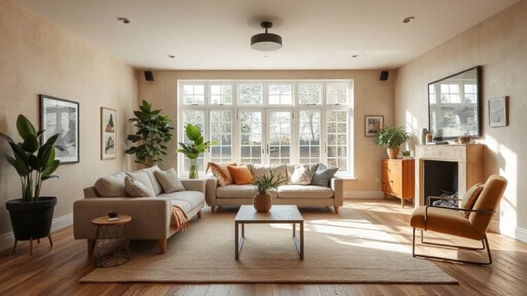
Cozy textures are the quiet engine behind rooms that feel snug and inviting. You’ll notice how textile layering adds depth without weight, letting light bounce off surfaces while keeping warmth in check.
Start with a plush foundation—soft rugs and tactile throws—then build with complementary fabrics in varied scales so the eye travels rather than stops. Plush furnishings anchor the space, offering that immediate sense of comfort while remaining structurally sound for daily use.
In practice, mix weaves, knits, and velvets to create a tactile rhythm that reads as intentional rather than cluttered. Think durable materials in high-traffic zones, paired with lighter textures on cushions and drapes to balance coziness with modern clarity.
This approach reinforces a calm, inviting UK home.
Warm Neutrals: Your Everyday Palette
Warm neutrals aren’t just a color choice; they’re the anchor of a versatile, easy-to-live-with palette. You’ll discover how this everyday spectrum grounds rooms without overpowering them, enabling subtle shifts in mood with minimal effort.
In practice, you pair warm beiges, creams, and taupes to create cohesive backdrops that layer well with textures and art, preserving balance as your spaces evolve. Color psychology informs your selections: softer tones calm active zones, while richer undertones add warmth to dining and living areas.
Precision matters in interior painting techniques—clean edges, mindful undercoats, and even sheen choices prevent muddy results and highlight architectural features. This approach supports flexible styling, longevity, and a refined, contemporary feel across UK homes.
Nature-Inspired Accents That Energize a Space
Nature-inspired accents bring immediacy to your space with tactile textures and plant-rich tones.
Lean into natural texture accents—think raw woods, wicker, and stone surfaces—paired with a biophilic color palette that breathes life into every corner.
This approach energizes rooms while staying grounded in UK design sensibilities, so your spaces feel both fresh and timeless.
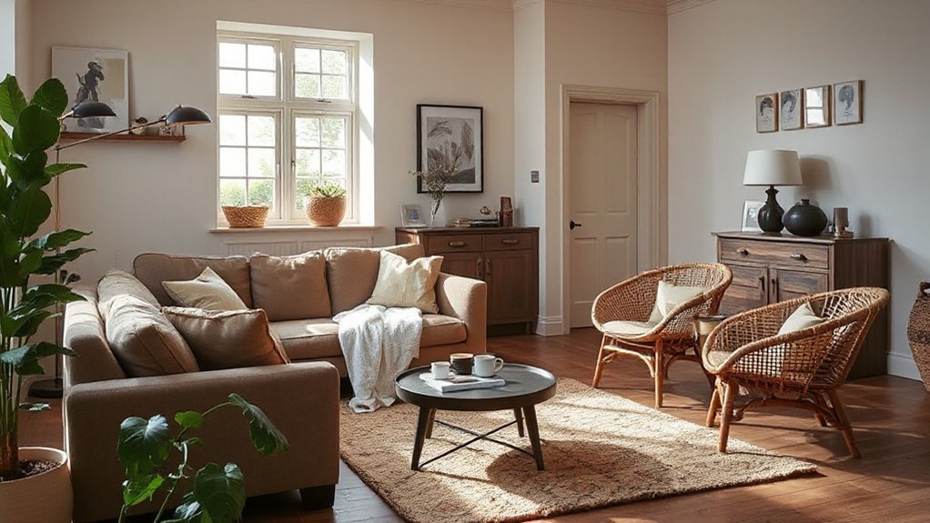
Natural Texture Accents
Natural texture accents bring immediate energy to a room. You’ll notice how tactile materials—jute, raffia, untreated wood, stone—add warmth without shouting.
In UK interiors, texture acts as a subtle anchor, guiding your eye and enhancing acoustics with quiet, purposeful presence.
You should layer materials at varying scales to create depth: a woven rug underfoot, a linen throw, tactile ceramic bowls, and raw timber furniture silhouettes.
When you’re choosing pieces, prioritize natural finishes over glossy surfaces to sustain a calm, grounded vibe.
Textile layering adds personality without clutter, while artistic wall decor can introduce organic texture through reliefs or tactile canvases.
Keep the palette earthy and cohesive to maximize the energizing effect without overwhelming the space.
Biophilic Color Palettes
Could color really influence mood as much as texture does? Yes—and in biophilic color palettes, you’ll feel the shift quickly. Think nature-inspired hues that regulate energy and calm: greens grounded in forest canopies, blues recalling sea and sky, earthy terracotta tones for warmth.
You’ll pair saturated accents with soft neutrals to keep spaces vibrant yet serene, preventing visual fatigue. This approach aligns with biophilic design principles by linking color to natural stimuli, enhancing focal points without shouting.
Prioritize indoor air quality as you select finishes and pigments; low-VOC paints and breathable fabrics sustain clarity of air and perception. Use layered tones to mimic daylight’s arc, creating dynamic rooms that feel both restorative and modern, perfectly suited to UK living.
Flexible Storage-Driven Layouts for Small Spaces
Flexible storage-driven layouts are redefining small UK spaces, proving that smart shelving, detachable units, and built-in furniture can expand both function and flow without sacrificing style. You’ll feel the difference when shelves morph into partitions, creating zones without walls.
Modular furniture lets you reconfigure rooms on a whim, swapping components as needs shift, from workspace to guest retreat. Hidden compartments keep surfaces clean and clutter-free, turning every inch into purposeful storage.
This approach prioritizes multi-function without bulk, embracing verticality and clever stowaways. Prioritize lightweight, durable finishes and cohesive palettes to maintain a calm, cohesive look.
You’ll notice increased perceived space as traffic flows improve and sightlines stay unbroken. Design confidence grows when flexibility becomes the default, not the afterthought.
Statement Pieces to Personalize Your Home
Bold pieces set the tone, so choose one that represents you and build the room around it.
Personalize with texture—think tactile fabrics, raised surfaces, and layered finishes that invite touch.
Add colorful accent details sparingly to create focal points without overwhelming the space.
Bold Statement Pieces
Bold statement pieces aren’t just decor; they’re anchors for your personality, signaling taste while guiding the room’s rhythm. You’re curating a dialogue between space and self, so choose items that resist passivity and spark conversation.
Opt for bold materials, striking silhouettes, and finishes that age gracefully, then ground them with balanced scale and negative space. In today’s UK trends, Art deco influences add architectural drama without shouting, while a vintage revival nod brings character with enduring appeal.
Integrate statement elements as focal points—an oversized lamp, sculptural chair, or lacquered sideboard—then let surrounding neutrals or soft textures temper effect.
Personalize With Texture
Texture is where personality gets tactile in UK interiors. You lean into texture to create instant warmth and depth, using it as a signature beyond paint. Start with textured wallcoverings to craft a unified backdrop that still reads as deliberate design, not filler.
Then layer tactile furniture—think boucle sofas, suede chairs, or a chenille ottoman—that invites lingering and conversation. You’ll notice how varied weaves, finishes, and fibers transform light and acoustics, giving rooms a sense of lived-in luxury without shouting.
Remember to strike balance: pair heavy textures with clean lines, so sculptural pieces don’t overwhelm. Personalization comes from subtle contrasts and curated materials, turning every corner into a tactile story you’re enthusiastic to return to.
Colorful Accent Details
Colorful accent details instantly punch up UK interiors, turning a calm backdrop into a personal statement without overwhelming the space. You’ll see how vivid color schemes elevate rooms, guiding mood and energy with intentional pops. Think bold cushions, thoughtfully painted trims, or a lacquered coffee table that acts as a focal point.
Playful accent walls anchor schemes without closing in the footprint, offering flexibility as trends shift. Use color strategically: repeat a hue across textiles, artwork, and hardware to create cohesion. Dip into saturated tones for personality, then soften with natural textures to maintain balance.
These details feel timeless when rooted in proportion and lighting. In short, colorful accents personalize spaces while preserving calm, cohesive design you’ll love.
Sustainable Materials for Everyday Homes
Sustainable materials aren’t a trend; they’re a practical standard redefining how everyday UK homes are built and updated. You’ll notice designers favor salvaged and rapidly renewable options that reduce embodied carbon without sacrificing style.
Think bamboo surfaces, cork flooring, and low-VOC paints that keep indoor air clean and inviting. Recycled metals and glass add a cool edge to hardware and accents, proving durability can coexist with modern aesthetics.
When you select materials, prioritise lifecycle impact: source locally, guarantee compostable or recyclable components, and demand transparent supply chains.
Eco friendly furniture and recycled decor aren’t gimmicks; they anchor responsible design as a living habit. This approach powers timeless interiors that balance function, form, and forward-thinking values.
Mood-Boosting Lighting for Day-to-Night Use
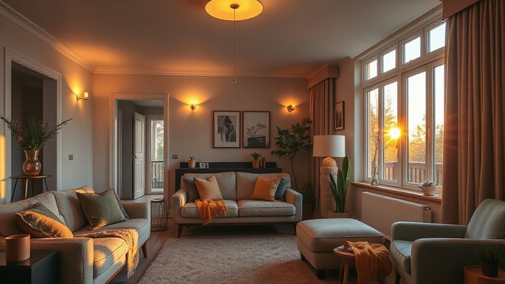
Mood-boosting lighting for day-to-night use hinges on smart layering and color temperature that adapt to your rhythms. You’ll harness warm tones during morning routines and cooler, focused light for work. Then, ease into gentle ambient hues as evening settles.
Smart technology enables precise zoning, so you can customize brightness and color per room or activity without fiddling with switches. Layered lighting reduces glare, enhances texture, and supports circadian-friendly patterns, keeping you energized by day and relaxed at night.
Energy efficiency comes from LEDs, dimming, and automated schedules that respond to daylight or occupancy. This approach isn’t just practical; it elevates mood and perceived space, aligning your environment with contemporary aesthetics and techno-forward living.
Embrace adaptive fixtures that anticipate your schedule for consistently balanced illumination.
Adapting Trends to Your UK Locale: Glasgow to Brighton
Across the UK, design sensibilities collide with local character, turning global trends into place-specific statements from Glasgow to Brighton. You tailor trends by listening to your space, climate, and culture, then blend core aesthetics with local texture.
In Glasgow, embrace Urban minimalism—clean lines, tactile materials, and moody palettes that withstand damp winters. In contrast, Brighton invites light, breezy quietness and playful color, balancing urban restraint with coastal warmth.
Adopt a modular approach: start with a neutral backbone, then layer character with statement textiles and vintage elements. Lean into a Vintage revival for charm without clutter, pairing retro furniture with modern silhouettes.
Prioritize adaptivity: protect finishes, optimize storage, and ensure lighting shifts with the day. Your locale guides trends; your home defines them.
Frequently Asked Questions
How Do UK Homes Balance Bold Trends With Resale Value?
You balance bold trends by prioritizing timeless design principles, then weave interior decor accents that feel current. You test resale value with neutral foundations, keeping spaces versatile; you iterate boldly in accessories, knowing restraint preserves market appeal and long-term satisfaction.
Which Colors Minimize Echo and Improve Room Acoustics?
Soft, sumptuous shades minimize echo and improve acoustics. You should prioritize soundproofing techniques and acoustic wall treatments, using bold, balanced colors that boost mood while maintaining resale value and staying on-trend for modern UK homes.
Can Trends Work in Rented Properties Without Renovations?
You can make trends work in rentals by using temporary decor and non permanent fixtures, swapping pieces as styles shift. Lean into adaptable, tasteful choices that respect restrictions, deliver impact fast, and let you test looks without commitment.
What Budget-Friendly Updates Deliver the Biggest Impact?
Did you know 68% of renters upgrade space with affordable accessories? You can, too. Focus on affordable accessories and DIY decor; quick, high-impact updates deliver big vibes without a renovation, transforming rooms while staying budget-smart and trend-forward.
How Do Seasonal Light Changes Affect Mood Lighting Choices?
Seasonally, you adjust lighting to optimize Natural illumination, choosing warmer tones as days shorten and cooler tones as days lengthen; this enhances Mood enhancement, guiding dimmers, layers, and smart controls for balanced ambience and sustained productivity.
Conclusion
As you decorate, think of your home as a ship. The hull is timeless material and warm neutrals; the sails are mood-boosting light and adaptive storage catching the wind. The crew—textures, nature-inspired accents, and sustainable choices—work in harmony, steering you through currents of trend without losing course. In your UK nook, Glasgow’s quiet resolve or Brighton’s breezy charm become your compass. Stay anchored to conscience, sail with style, and your space will weather every season.