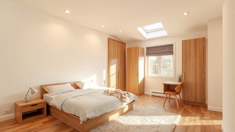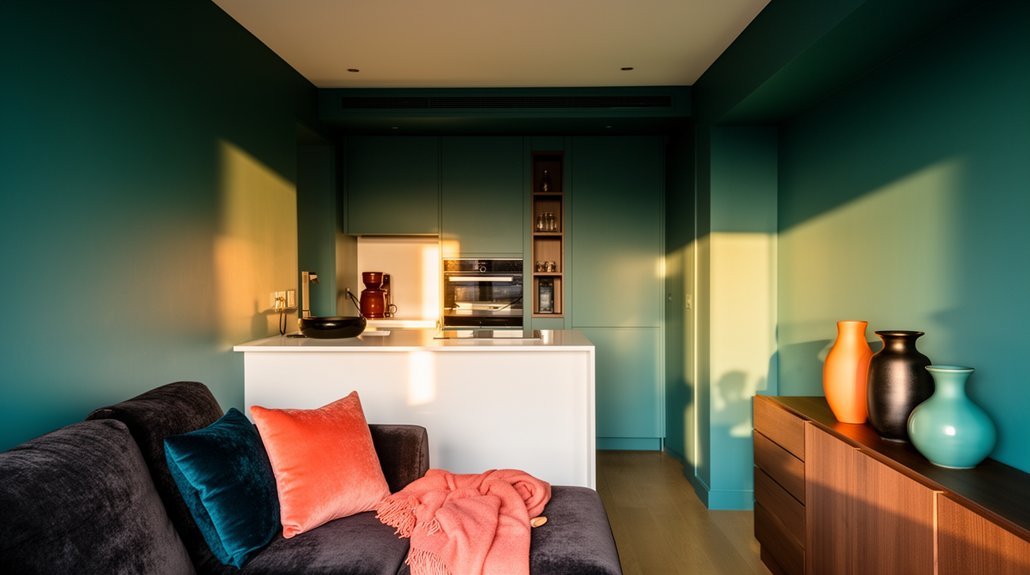
Kick off with tonal neutrals as your base and choose one bold accent to anchor the scheme. Layer texture with fabrics, wood, and tactile wallpapers, then sculpt depth with layered lighting and smart color placement. Define tiny rooms by outlining zones, using lighter wall tones to expand space, and reserving saturated hues for focal points. Maintain cohesion with repeated finishes and a streamlined silhouette. Keep clutter controlled and flow smooth, and you’ll reveal practical, color-driven comfort—more awaits if you keep exploring.
Build Tonal Neutrals With One Bold Accent: a Step-By-Step Palette
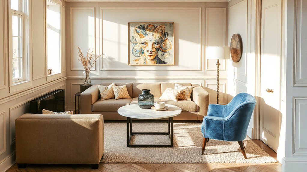
A tonal neutral base keeps a small space feeling calm and cohesive, while a single bold accent adds personality without overwhelming the room. You’ll start with a neutral scaffold—warm or cool, depending on light—then choose one focal hue to guide the palette.
Color psychology informs your choices: consider how each shade influences mood and perceived space, avoiding fatigue through restrained use. Next, plan furniture contrast to sharpen definition: pair lighter upholstery with darker wood or metal accents, and maintain edges stay crisp to maintain clarity.
Apply the bold accent sparingly—introduce it in a single chair, rug, or art piece, not all at once. Preserve balance by distributing color weight across zones, and always test under natural and artificial light before finalizing.
Layer Color With Texture and Lighting to Add Depth
Layer color isn’t just about hue; pair it with textures to create tactile contrast that reads as depth. Use lighting to sculpt those layers, highlighting texture while keeping the palette cohesive.
Start by testing a simple combination, then refine until the space feels richer without crowding it.
Layer Color, Texture
When you layer color with texture and lighting, you create depth that makes small spaces feel larger and more cohesive. You’ll use color psychology to guide wall, furniture, and accessory choices, selecting tones that calm, energize, or focus attention where needed.
Balance matters: pair matte finishes with subtle gloss or metallic accents to introduce material contrast without visual clutter. Start with a neutral base and introduce a single saturated hue through textiles or art, then reinforce that color in smaller doses across cushions, throws, and cabinetry.
Texture adds tactility and dimension; combine woven fabrics, linen, and tactile wallpapers with smooth painted surfaces to prevent flatness. Keep lighting layered and warm to reveal nuance, not glare.
Illuminate With Depth
Start by uniting color, texture, and lighting into a single strategy that adds measurable depth. You’ll layer a calm base color with tactile materials, then introduce lighting that sculpts shadows and highlights.
Use color psychology to choose hues that influence perception: cool tones push back walls visually, warm accents pull you forward, and midtones balance space.
Pair matte finishes with gloss or metallic accents to create material contrast without clutter.
Place lighting at varying heights and intensities—wall washers, floor lamps, and directed spotlights—to carve dimension and guide attention.
Keep furniture slim and elevated if possible, so light can flow beneath and around pieces.
Test contrasts in a mirror or photograph, adjusting until depth is felt, not seen as clutter.
Create Bold Monochrome Looks: Rules for Balance and Clutter-Free Rooms
Bold monochrome looks can sharpen a small space, but success hinges on balance and a clear plan for clutter-free rooms. You’ll anchor the scheme with a dominant neutral and introduce high-contrast accents to guide the eye.
Keep surfaces tidy and limit decorative items to a curated few, arranged in vertical lines to emphasize height. Use bold contrast sparingly—one strong focal piece or a single patterned rug—and let negative space breathe.
Store clutter behind closed panels or within multipurpose furniture to preserve the clean silhouette. Apply color psychology by associating whites and charcoals with calm and focus, then inject texture through matte finishes, metal, or glass.
Maintain consistency across furnishings to avoid visual noise and preserve the monochrome integrity.
Use Soft Pastels to Make Small Spaces Feel Airy and Calm
Soft pastels soften a small space without leaning into gimmick. You’ll feel calmer and more spacious when you choose muted tones that reflect natural light and avoid heavy contrasts.
- Use pastel wall accents to create focal points without overpowering the room.
- Pair soft fabric textiles with light woods for cohesion and warmth.
- Balance color with white or off-white surfaces to maintain airiness.
- Limit options to two to three complementary pastels for clarity and calm.
Pastel wall accents should stay modest—think lavender, blush, or sage in small doses.
Soft fabric textiles—duvet covers, cushions, throws—anchor the palette and enhance texture.
Prioritize even lighting and minimal clutter so the airiness remains intact.
You’ll maintain a serene, breathable feel while preserving visual depth and practical usability.
Define Tiny Rooms With Color Placement and Zoning
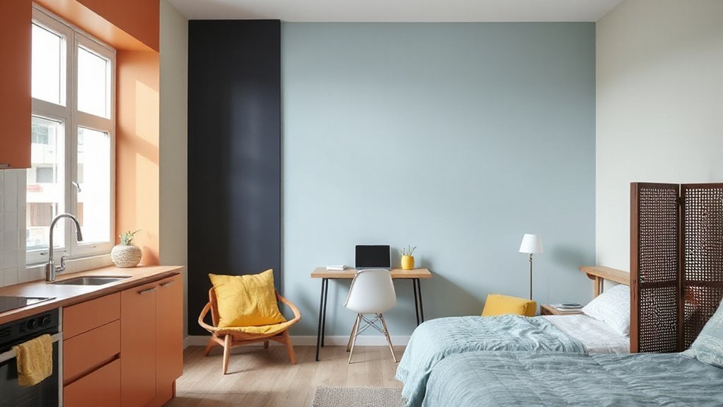
Color placement and zoning are practical tools to define small rooms without crowding them. You start by outlining zones with color boundaries that guide movement and function. Use lighter hues on walls to expand perceived space, and reserve saturated accents for focal areas where you want attention.
Color psychology informs your choices: cool tones calm streaming light, warm tones invite social zones, and neutral anchors balance contrasts. Plan furniture placement to reinforce these zones, grouping seating near natural light and aligning desks with entry points to improve flow.
Avoid overloading walls; clip art sparingly to prevent visual clutter. Implement color gradations between zones through trim, cabinetry, or textiles rather than radical shifts, preserving clarity while enhancing perceived room scale.
Elevate Architecture With Smart Accents and Built-In Storage
Architecture in small spaces benefits most when smart accents and built-in storage work together to streamline form and function. You harness smart accents to define zones without bulk, while built-in storage hides clutter behind clean lines, preserving airflow and light.
Use adjustable shelves, recessed niches, and concealed LED strips to emphasize height and depth, not overwhelm it. Pair these with integrated cabinetry that doubles as architectural detail, so every surface serves a purpose.
- Install wall niches for display and storage, keeping floors clear.
- Choose multipurpose furniture with hidden compartments to maximize utility.
- Integrate furniture edges with architectural lines to unify the space.
- Plan access routes that keep traffic smooth and sightlines open.
Smart accents, built-in storage.
Pull the Look Together: Cohesion and Flow Across Small Apartments
You’ll start by establishing a cohesive color palette that links every zone. Then guarantee flow through deliberate zoning so each area reads as part of a single story.
Maintain consistent finishes across surfaces and materials to reinforce unity, while allowing subtle contrasts to define function.
Keep the shifts smooth, using repetition and a restrained palette to guide the eye and movement through the space.
Cohesive Color Palettes
To pull a small apartment together, start with a cohesive color palette that ties every zone to a single mood and finishes each piece with purpose. You’ll use color psychology to select a base that feels calm yet purposeful, then layer complementary schemes for contrast without chaos. Keep evidence of the palette consistent across furniture, textiles, and walls to maintain flow.
Precision in timing and tint choices prevents overcrowding, while repeatable accents create cohesion.
1) Establish a dominant neutral grounding and introduce 1–2 accent hues for impact
2) Use consistent undertones across finishes to avoid jarring shifts
3) Apply color in controlled increments, not all at once
4) Test light scenarios early, adjusting saturation for a balanced feel
Flow Through Zoning
Rely on color psychology to assign moods: calmer tones for work zones, warmer accents for social areas, and a consistent base to tie everything together. Arrange furniture placement to maximize sightlines, guarantee circulation, and reinforce the color flow; place sofas and desks to face shared focal points and adjacent walls with harmonious hues.
Use rugs, textiles, and lighting to reinforce zones without abrupt changes. Maintain deliberate rhythm through repeat materials, avoiding overcomplication while preserving practical flow.
Consistent Finishes Throughout
Consistent finishes tie your small apartment together by repeating core materials, color notes, and surface textures across every zone. You’ll create cohesion by aligning countertops, cabinetry, fabrics, and hardware with a unified palette and tactile language.
Color psychology guides your choices, ensuring hues support mood and function in each area, while a shared paint finish reinforces continuity from room to room.
- Choose a signature paint finish (matte, satin) and carry it through walls, ceilings, and built-ins to minimize reflection gaps.
- Repeat a dominant material—wood, stone, or metal—across kitchens, bedrooms, and living zones for visual harmony.
- Echo color notes in textiles and accessories to tie spaces without overpowering.
- Map progressions with subtle trim and edge detailing so edges feel deliberate, not disparate.
Frequently Asked Questions
How to Choose Colors That Affect Mood in Tiny Spaces?
Choose colors based on color psychology: surround yourself with mood-enhancing hues like soft blues for calm, warm yellows for energy, and muted greens for balance; test swatches, use contrast sparingly, and let lighting adjust their tone.
Can Color Impact Perceived Ceiling Height in Small Rooms?
Yes, ceilings painted lighter than walls can visually raise a room by about 1/2 to 1 foot. Ceiling color and wall color matter; use bright ceilings and mid-toned walls to enhance perceived height.
Which Finishes Enhance Color Without Looking Busy?
You should choose calm, restrained Finishing materials and avoid busy patterns. Color psychology shows you can enhance color without clutter by pairing cool neutrals with a single bold accent. Keep surfaces simple, cohesive, and legible for balance.
How to Test Colors Before Committing in Rentals?
Color tests save you time: try wall paint in large swatches and hold fabric swatches beside them. You’ll see true tones in rentals, so compare under different lighting before committing.
What Are Budget-Friendly Ways to Refresh Color Accents?
You can refresh color accents on a budget by using Color psychology insights to choose calming or energizing hues, and try practical Accent wall ideas like a single bold stripe, DIY mural, or removable wallpaper for impact with restraint.
Conclusion
Color speaks in small spaces. By layering tonal neutrals with one bold accent, you create contrast without clutter, while texture and lighting add depth so every corner reads intentional. Use soft pastels to breathe calm, and place color to zone tiny rooms for visual order. Built-in storage elevates architecture, not overwhelms it. Cohesion across your apartment ties the look together. Ready to color your micro-home with purpose—can you see how balance makes space feel larger and alive?
About the Author