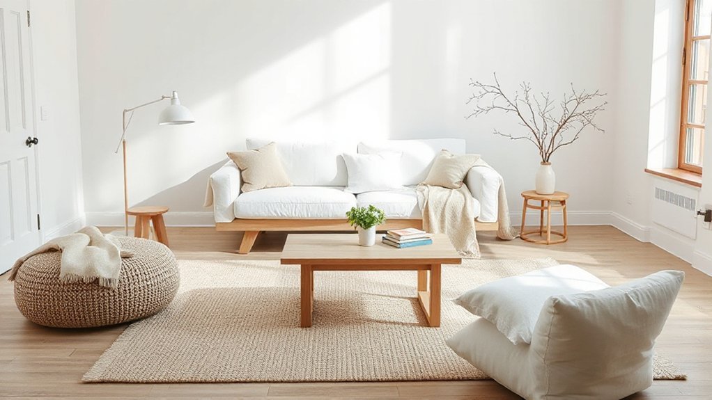
A Scandi-style living room with soft neutrals balances warmth and calm through clean lines, functional pieces, and purposeful contrast. Start with a base of cool gray or warm stone, layered with greige and oat, and punctuate with chalk white or pale blue for light and contrast. Use natural textures—linen, wool, unvarnished wood—and keep surfaces uncluttered with closed storage. Layer lighting, mix wood tones thoughtfully, and add durable textiles for daily life; subtle effects await beyond this overview.
What Defines Scandi Style in Soft Neutrals
Soft neutrals define Scandi style by the deliberate balance of warmth and simplicity. You frame spaces with understated palettes, relying on light, texture, and form to convey calm.
The defining logic centers on restraint: clean lines, functional pieces, and purposeful contrast that preserves airiness. Color psychology informs you that soft hues reduce visual noise, enhancing perceived serenity and focus, while subtle warmth prevents clinical stiffness.
Materials emphasize tactility—unvarnished woods, linen, wool, and ceramics—driving comfort without clutter. You acknowledge Scandinavian history as a guide, not a constraint: traditions of resourcefulness, daylight optimization, and modular design translate into modern neutrality.
As you select accents, you prioritize quality over quantity, ensuring each item supports a cohesive quiet. This approach yields enduring, adaptable interiors aligned with practical living and timeless aesthetics.
Quick-Start: Choosing a Base Neutral Palette
Choosing a base neutral palette sets the foundation for Scandi-style living rooms, guiding light distribution, texture, and furniture scale. You’ll calibrate hues to optimize color psychology, ensuring calm, balanced illumination and perceived spaciousness.
Start with a dominant cool gray or warm stone as your anchor, then introduce supporting tones through accents and textiles. What you pick affects furniture arrangement, too—clear sightlines, purposeful spacing, and proportional silhouettes stay in harmony with the palette.
- Establish a dominant base (e.g., light gray or warm beige).
- Add midtones for depth (greige, oat).
- Reserve a crisp accent (chalk white, pale blue) for contrast.
This approach yields a timeless, cohesive backdrop for furnishings, accessories, and lighting, aligning color psychology with practical layout considerations for a serene, functional space.
Elevate Warmth With Natural Textures: Wool, Wood, and Linen
You’ll explore how natural textures set the foundation for warmth by prioritizing wool, wood, and linen in your space.
Woolen warmth details add softness and durability, while wood brings tactile contrast and structure.
Linen surface layering provides breathability and a refined, matte finish that complements a calm Scandi palette.
Natural Texture Focus
Natural textures are the backbone of warmth in Scandi-style living rooms, where wool, wood, and linen create tactile depth that’s both inviting and durable. You’ll engage color psychology by pairing neutral bases with restrained accent hues, reinforcing minimalist decor while maintaining coziness.
To execute this, consider three practical applications:
1) Layer wool throws and felted cushions for acoustic softness and visual warmth.
2) Highlight light-wood furniture with clean lines to preserve airiness and structural clarity.
3) Integrate linen drapes and a textured rug to modulate shade, texture, and humidity balance.
This approach preserves a calm palette, supports durable surfaces, and enhances tactile perception. The result is a refined, practical space where warmth derives from material honesty and purposeful restraint.
Woolen Warmth Details
Woolen warmth Elevates a Scandi living room by prioritizing tactile comfort and acoustic resonance, so you’ll notice the cozy softness of wool fibers in blankets, throws, and cushions that soften hard lines.
You apply textured accents with deliberate wool selections, balancing weight and drape to maintain a calm, cohesive palette. In practice, weave woolen warmth into seating edges, layered throws, and compact pillows to anchor neutrals without visual clutter.
Pair with smooth wood surfaces and linen textures to enhance depth while preserving tonal serenity. Use natural wool finishes that resist pilling and minimize sheen, ensuring a durable, timeless read.
This approach delivers precise warmth, controlled acoustics, and a polished, lived-in elegance grounded in textured accents.
Linen Surface Layering
- Select linen pieces in varying weaves and weights to create subtle shadow lines across sofas, chairs, and throws.
- Pair linen with complementary wood tones and cool-toned wool accents, ensuring cohesive undertones rather than competing hues.
- Maintain a restrained scale: large panels, mid-sized cushions, and narrow runners to sustain a calm, ordered rhythm.
This approach emphasizes textile layering as a functional, tactile strategy, delivering warmth without clutter while supporting the room’s serene, minimalist ethos.
Layer Lighting for a Calm, Airy Space
Layer lighting creates a calm, airy base by layering ambient sources with soft, calming tones. You’ll balance brightness and temperature to guarantee each zone feels cohesive rather than harsh or flat.
This approach helps you control depth and mood without cluttering the space.
Layered Ambient Lighting
1) Diffuse ceiling and wall fixtures create a soft baseline that reduces contrast.
2) Task lights near seating and surfaces support focused activities, like dining room meals or reading, without overpowering the space.
3) Accent lights highlight textures and architectural details, enhancing bedroom decor cues while preserving airiness.
Control strategies matter—dimmers, tunable LEDs, and smart scenes maintain harmony across living, dining, and lounging moments. Layering fosters clarity and calm.
Calming Light Tones
Keep color temperature in the warm-to-neutral range to support perceived space and comfort. Color psychology informs how brightness and hue influence mood, so favor light sources that read as gentle rather than clinical.
Neutral color palettes reinforce this strategy, minimizing perceptual noise and enabling subtle texture to register. Combine ambient, task, and accent layers sparingly, ensuring each element supports airiness, depth, and balance without competing focal points.
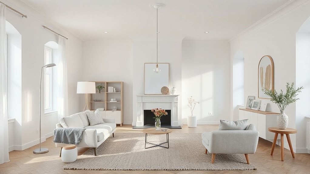
Essential Furniture for a Pared-Back Scandi Vibe
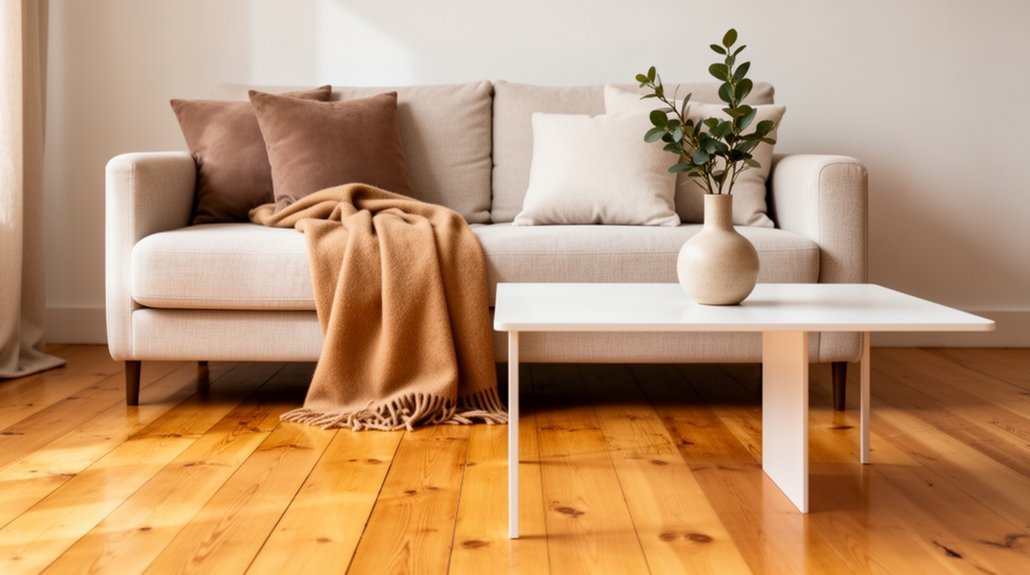
A pared-back Scandi living room hinges on a small, well-chosen set of essentials: a clean-lined sofa, a minimalist coffee table, and a functional storage piece in natural wood or matte finishes. You choose forms that stay airy, with neutral upholstery and hidden hardware to maintain quiet lines. Focus on materials that age gracefully and resist trend fatigue.
3-item list:
- Clean-lined sofa with slim arms
- Low-profile coffee table in pale wood
- Tall, unobtrusive storage unit with closed storage
Vintage accents and bold patterns punctuate the restraint, when used sparingly. Place a single vintage lamp, a woven textile, or an art print to anchor the room without overpowering it. Finish with precise spacing, balanced proportions, and tactile surfaces to preserve the pared-back ethos.
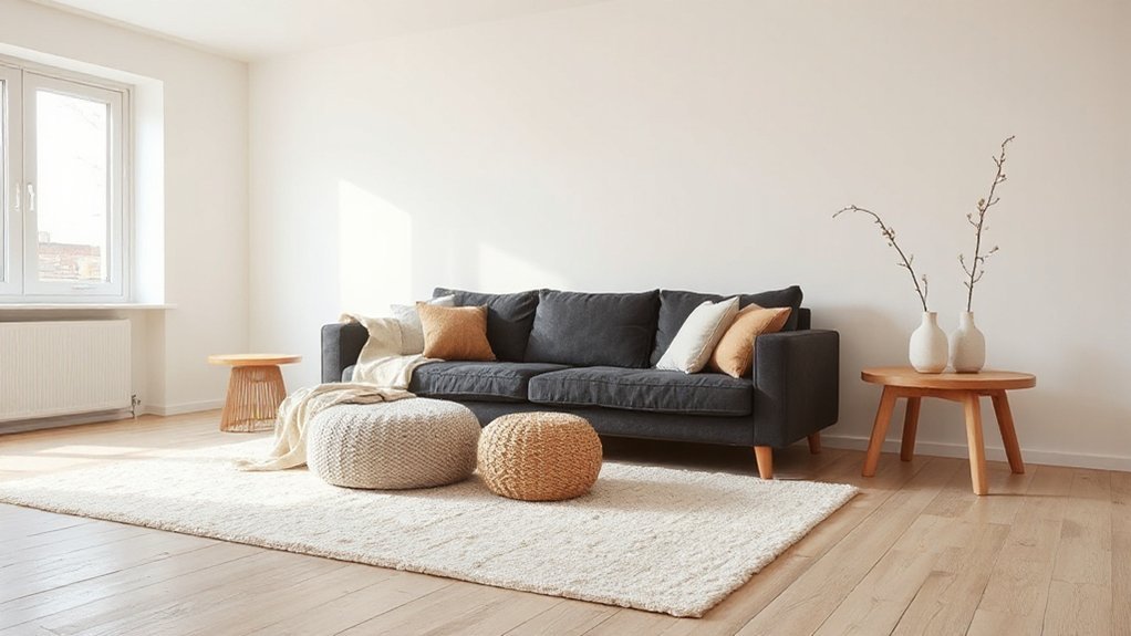
Cozy Touches: Throws, Rugs, and Blankets That Invite Relaxation
Building on a pared-back foundation, cozy touches soften the room without compromising restraint. You select throws, rugs, and blankets that enhance tactility while maintaining the Scandi ethos. Favor natural fibers—lamb’s wool, cotton, and a subdued boucle—to create quiet warmth without visual overload.
Layer textures deliberately: a lightweight throw over a sofa, a low-pile rug underfoot, and a knit blanket folded at the chair’s edge. Integrate vintage patterns sparingly, using them as accents rather than anchors to avoid disorder.
Choose neutral palettes with subtle contrast, ensuring consistency with wall color and furniture finishes. For focal appeal, introduce statement art framed to mirror the textiles’ tonal range.
Guarantee edges remain crisp, seams aligned, and compression minimized for a calm, cohesive relaxing zone.
How to Pair Wood Tones Without Clash
Pairing wood tones without clash hinges on deliberate contrast and consistent undertones. You’ll align hues by balancing light, medium, and dark woods, ensuring shared undertones—warmth, ash, or olive—thread through the scheme.
Color psychology informs which pairings feel cohesive, calm, or energizing, so pick a dominant wood with a soothing base and accent with a contrasting shade sparingly. Furniture arrangement then enforces rhythm, not random mixing.
- Establish a primary wood as the visual anchor, then introduce 1–2 supporting tones sparingly.
- Use textural variation—grain direction and surface finish—to create depth without color conflicts.
- Place lighter woods where natural light is strongest, and reserve darker tones for focal pieces or anchors.
This approach maintains clarity, contrast, and harmony across the room.
Keeping Scandi Serene With Kids and Pets
Balancing the calm, clean lines of a Scandinavian aesthetic with the demands of active households means designing for resilience as well as restraint. You implement durable materials and straightforward silhouettes that tolerate kids and pets while preserving serenity.
Choose finishes with low maintenance requirements, and layer protective textiles, like woven rugs and slipcovers, that lift daily wear from surfaces.
Incorporate botanical patterns in controlled, repeat motifs to add depth without visual noise, and deploy vibrant accents sparingly to preserve airiness.
Storage should be accessible, with closed cabinetry reducing clutter visibility and open shelving for intentional display.
Hard-wearing, easy-clean surfaces—laminate, sealed concrete, or engineered stone—keep spills manageable.
Prioritize stealth color harmonies to prevent overstimulation, maintaining the room’s calm, cohesive axis.
Greenery and Organic Accents for Effortless Calm
To cultivate effortless calm, integrate greenery and organic accents that feel anchored rather than ornamental. You’ll reinforce the room’s balance by selecting botanical prints and objects with clean, restrained lines, emphasizing texture over color saturation.
Prioritize scale and proportion so every element reads as intentional, not decorative noise. Use organic shapes to soften edges and maintain visual cohesion across surfaces.
- Choose a single statement plant with architectural form—its silhouette anchors the composition.
- Pair botanical prints with neutral mats and sparse framing to preserve clarity.
- Integrate textiles and ceramics in muted tones that echo natural hues, reinforcing calm without competing focal points.
Small-Space Tricks to Maximize Airiness in Neutrals
Neutral tones open up space quickly, so small adjustments can yield noticeable airiness without sacrificing warmth. You optimize a neutral palette by prioritizing light, unobtrusive surfaces and strategic alignment of elements.
Color psychology informs your choices: brighter neutrals reflect natural light, while cool undertones reduce perceived density. Choose matte finishes and glass or acrylic accents to maintain transparency without glare.
Furniture placement matters: keep traffic lanes open, float essential pieces away from walls, and use multifunctional, compact storage to avoid visual clutter. Scale matters more than quantity; opt low-profile sofas and slim chairs to preserve sightlines.
Vertical tactics, like tall, slim bookcases, draw the eye upward. Finally, minimize heavy drapery; select sheer textiles to preserve luminosity.
Uncluttered Storage: Chic Organization That Stays Tidy
Uncluttered storage delivers both function and form, keeping essentials accessible while preserving calm, airy aesthetics. You’ll implement disciplined systems that blend seamlessly with Scandinavian restraint, ensuring every item has a dedicated place.
Streamlined storage solutions emphasize modularity, label clarity, and durable finishes that resist visual noise. Decorative baskets anchor shelves and tables, offering texture without disruption to the neutral palette.
To illustrate, consider the following:
- Utilize shallow, labeled bins under coffee tables for remote controls, chargers, and manuals.
- Group similar items in uniform baskets on open shelving to create quiet, cohesive rhythms.
- Select stackable containers that expand with your needs while maintaining a clean profile.
Your approach balances accessibility with restraint, delivering tidy surfaces and a tranquil, organized living space.
Texture-Forward Accessories: Metals, Ceramics, and Linen
Metals introduce tactile contrast that amplifies light and texture without visual clutter.
Linen adds breathable warmth, while ceramic forms sculpt the space with quiet, tactile nuance.
Together, these materials define texture-forward accents by balancing sheen, porosity, and matte finishes to support the Scandi core.
Metals for Texture
To introduce texture through metals, start by choosing hardware, accent pieces, and lamp finishes that add depth without overpowering the room. You’ll shape contrast and cohesion by selecting finishes that echo—yet don’t match—your existing neutrals.
Use metal textures to frame soft surfaces, creating a tactile hierarchy.
- Install matte brass drawer pulls for warmth and subtle shine.
- Pick brushed nickel lamps to balance cool tones with muted reflective surfaces.
- Layer pewter frames and steel trays to introduce Vintage accents and keep Bold patterns visually grounded.
Pros you’ll notice: refined durability, reduced glare, and an understated glow. Metals should support the palette, not dominate it, ensuring a calm, cohesive, texture-forward space.
Linen and Ceramics Notes
Linen and ceramics add texture-forward nuance by balancing softness with sculptural form, guiding light and space without competing with a calm, neutral palette. In this subtopic, you’ll observe how linen’s natural drape and ceramic surfaces create tactile contrast that reads as refined restraint.
Linen introduces subtle variation through weave and fiber tone, while ceramics deliver clean lines, gentle glazes, and porous texture that catch and reflect ambient light. Pairing: avoid overwhelming the room with busy patterns; instead, leverage vintage patterns in textiles as accent pops and ceramic glazes that echo these motifs.
Color blocking appears when combining solid linen panels with sculpted ceramic pieces, establishing clear, chic blocks of shade. The result: a composed, durable texture matrix that reinforces Scandi sophistication.
Maintenance and Longevity: Keeping Neutrals Fresh Over Time
Neutral tones require intentional care to prevent dulling over time; with proper maintenance, your neutrals stay fresh and versatile. You’ll manage appearance and longevity through disciplined cleaning, material awareness, and deliberate styling choices that respect color psychology and eco-friendly materials.
- Schedule routine, low-impact cleanings with pH-balanced solutions to preserve fibers and finishes, reducing yellowing and texture loss.
- Rotate textiles and furniture accents seasonally, distributing wear evenly and leveraging natural light to maintain tonal balance without fading.
- Select durable, eco-friendly materials and finishes for replacements, prioritizing stain resistance, UV stability, and easy repairability.
Frequently Asked Questions
How to Choose a Timeless White Base Without Glare?
Yes—choose a matte, low-glare white base, avoiding pure bright whites. Balance with controlled color contrast, and layer Surface textures to reduce harsh reflections for a timeless look; guarantee your whites respond softly under varied lighting.
Which Neutrals Pair Best With Warm Wood Tones?
Neutrals that pair best with warm wood tones are soft taupe, creamy ivory, and muted sage. About 72% of designers note high color contrast improves perceived depth; apply texture layering to elevate warmth and refine the finish.
Can I Mix Modern and Vintage Scandinavian Pieces?
Yes, you can mix modern and vintage Scandinavian pieces. Combine Vintage accents with Modern furniture thoughtfully, balancing lines and materials, ensuring cohesive color accents and proportional scales to maintain a polished, technical, authoritative aesthetic in your space.
How Often Should I Refresh Textiles Without Losing Style?
Refresh textiles every 1–2 years for consistent style retention, prioritizing durability. Textile durability matters; opt for premium fabrics and seasonal updates to maintain a polished look without sacrificing performance, like a retro smartwatch guiding modern care.
What Lighting Levels Suit Soft Neutral Interiors?
Ambient lighting should be subtle yet sufficient for tasks, around 100–300 lux, with accent illumination added to highlight textures. You balance levels by dimming overheads and using lamps to create layered, cohesive, soft neutral interiors.
Conclusion
In soft neutrals, your space becomes a calm, adaptable backdrop for daily life. By balancing texture with light and keeping surfaces uncluttered, you’ll preserve an airy, timeless vibe. Prioritize warmth through natural materials and layered lighting to avoid the flatness that plagues colder palettes. Maintain intentional storage and care to keep tones pristine. Ready to embrace a serene, durable Scandi footprint, where less truly is more? Yes—and it stays polished with consistent, mindful upkeep.